When you’re a provincial football club participating in the amateur leagues of the American north-east, you probably shouldn’t be able to boast a social media following tallying almost 20,000 people. Yet across the United States, and indeed the globe, Rhode Island’s very own Providence City FC have been making a very particular kind of impact.
A quick look at the shirts
https://youtube.com/shorts/s_invDND8Ug
How They've Done It
Hailing from the ‘Creative Capital’ of the US, Providence City – or the Rogues as they are commonly known – have been revolutionising kit design since their inception in 2015 by eschewing a reliance on templates and partnering with local businesses and artists to create some truly unique ensembles.
Given the club’s propensity for challenging norms, their popularity has soared, especially among the kit collecting community, as more and more fans from around the world look to become part of the Rogue movement where fashion and football collide in a spray of paisley, sprinkles and, uh, hammerhead sharks.
By their own admission, the Rogues are not just looking for success on the football pitch. Though they are members of three separate leagues – the Bay State Soccer League, the Ocean State Soccer League and FA 1 – their mission upon their foundation was, and remains to this day, a commitment to building and fostering a holistic football culture within the city. And a huge facet of this involves the collaborative design of unique, often unorthodox kits intended to be worn not only on the field of play but the terraces and beyond.
The Shirts
The HAMR Shirt
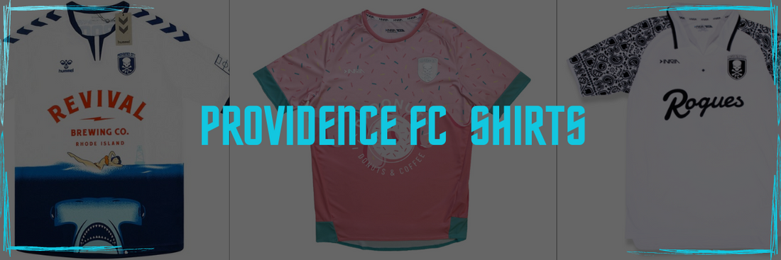
Take, for example, their 2019/20 HAMR shirt which was developed in conjunction with local craft beer company Revival Brewing. Produced by Hummel – who despite the unique nature of the kit left their hallmark in the form of their trademark chevrons down both sleeves – it features a sublimated design intended to replicate a beer can, while Revival owner Sean Larkin chose to depict the New England native hammerhead shark on the front. Not to forget, of course, the famous Providence club crest; originals that feature the embroidered badges are still highly coveted among kit collectors.

The HAMR design, however, is just one of a number of audacious efforts to have emerged from the crucible of the Creative City since 2015. So much so that the club name is now practically synonymous with artistic endeavour, and collectors await each new release with tremendous anticipation.
Treat Yo Self - Donut Shirt
Club founder Jason Rego takes a hands-on approach to the conceptualisation, design and execution of the Rogues’ slew of shirts, including another popular classic in the form of the outrageously vibrant Treat Yo’ Self doughnut design, which, if you’ll excuse the pun, is anything but half-baked.

Replacing Hummel as the supplier, Toronto-based Inaria worked closely with Rego to create this saccharine morsel, and it was launched in partnership with PV Donuts – most famous for introducing brioche-style doughnuts to New England.
The shirt features a half-and-half design, depicting hundreds-and-thousands on top and a glazed finish below, and the almost juvenile colour scheme creates a pleasing juxtaposition with the Rogues’ famous skull-and-crossbones crest which lurks among the sprinkles on the left breast.
Good Night Lights Shirt
Providence City’s shirt designs are not just superficial forays into fashion, either. The Good Night Lights kit was sponsored by Providence establishments Hot Club and Soiree Salon, both of whom engage in the Good Night Lights tradition whereby local businesses flash their lights to say hello to the patients at the nearby Hasbro Children’s Hospital. That the shirt is a fetching champagne gold with a smart collar and asymmetrical patterning is but a welcome bonus.

This community atmosphere is integral to the football culture the Rogues have been building and it will come as no surprise to learn that a fundamental tenet of this culture is inclusivity. Football is a sport for all, and Providence City reiterated this stance with their effortlessly cool pride offering, featuring horizontal pin-stripes, the vowelless club name and the skull-and-crossbones crest all rendered in rainbows.
Death By Paisley Shirt
Many of Providence City’s kits have been made in the last few years by the aforementioned Inaria, whose name fittingly translates as “in the eighteen yard box” in Italian. A custom-kit design agency, this do-it-yourself ethos is perhaps most present in the 2021 away shirt, titled Death by Paisley. A striking monochrome offering, the team nickname stands out in bold across the chest in lettering reminiscent of the Yankees, while the paisley shirt sleeve detailing invokes a Day of the Dead meets punk rock vibe.

Providence City Pride Shirt
One of our recent favourites saw the release of a Pride shirt. This has been achieved with a tasteful design that serves as a football shirt for the team.

Rhode Island Problems Shirt
This is one of their classic designs. A bold-looking shirt that comes back to its roots on Rhodes Island.

Seven years into their mission to mark Providence, Rhode Island on the football map, Providence City FC have been successful in doing just that. There are bigger teams in the United States – better teams, even – but mention their name to anyone with an interest in football shirts and the recognition is immediate. Simply put, there are none quite so adept at bringing sport and fashion together as the Rogues.
