Aston Villa Shirt History: Sponsors and Kits
Founded in 1874, Aston Villa are one of the oldest English football clubs in existence and, with seven First Division titles, seven FA Cups, five League Cups, a European Cup and a European Super Cup, they are one of the most successful too. Let’s delve into their shirt manufacturer and sponsorship history: You can shop the latest stock of Aston Villa shirts here.
Jump to Section
Kit Manufacturers
- 2022–Present – Castore
- 2019–2022 – Kappa
- 2018–2019 – Luke 1977 / Fanatics
- 2016–2018 – Under Armour
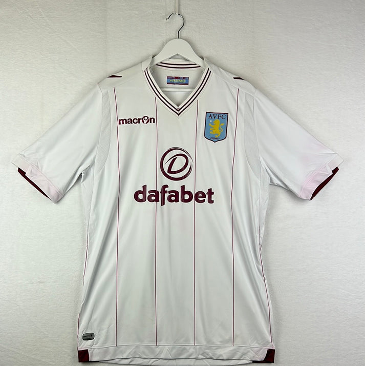
- 2012–2016 – Macron
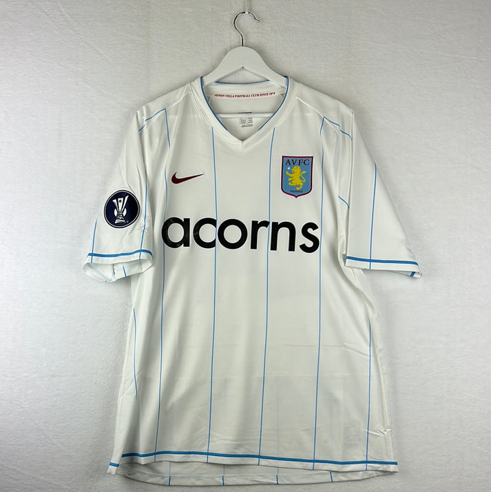
- 2007–2012 – Nike
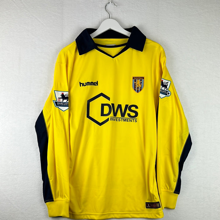
- 2004–2007 – Hummel
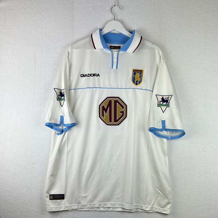
- 2000–2004 – Diadora
- 1995–2000 – Reebok
- 1993–1995 – Asics
- 1990–1993 – Umbro
- 1987–1990 – Hummel
- 1985–1987 – Henson
- 1982–1985 – Le Coq Sportif
- 1970–1981 – Umbro
Shirt Sponsors
- 2023–Present – BK8
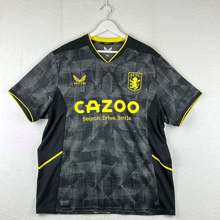
- 2020–2023 – Cazoo
- 2019–2020 – W88
- 2018–2019 – 32Red
- 2017–2018 – Unibet
- 2015–2017 – Intuit QuickBooks
- 2013–2015 – Dafabet
- 2011–2013 – Genting Casino
- 2010–2011 – FxPro
- 2008–2010 – Acorns
- 2006–2008 – 32Red
- 2004–2006 – DWS Investment
- 2002–2004 – MG Rover Group
- 2000–2002 – NTL:
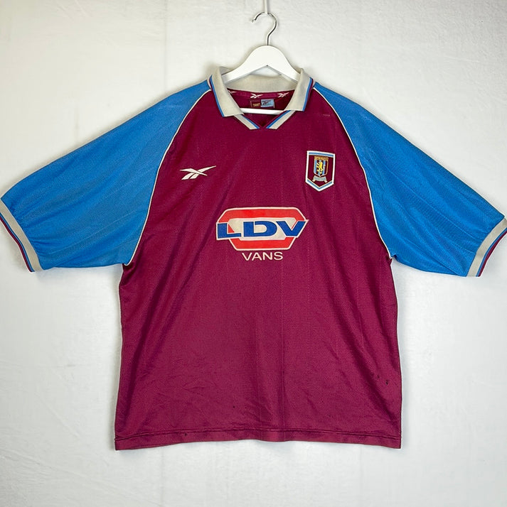
- 1998–2000 – LDV Vans
- 1995–1998 – AST Computer
- 1993–1995 – Müller
- 1983–1993 – Mita
- 1982–1983 – Davenports
Aston Villa Shirt History - 1990 - 2023 - Downloadable guide

Aston Villa Shirt Manufacturer History
2022 – present – Castore
In 2022, the Villains signed what was described as a ‘landmark multi-year partnership’ with Castore, but that looks set to be cut short with complaints about the shirt quality flooding in. Villa players have complained about the 2023/24 kit becoming ‘soaked in sweat’ just minutes into a game providing a heavy, wet look.
That said, on the design front, the manufacturer hasn’t done too badly with the spoken about strips and have included some lovely personal touches. For example, the home strip includes a subtle background print of the soundwaves taken from the Villa faithful blurring out their famous ‘Allez, Allez, Allez’ chant on a matchday. A circular crest was also used on all playing and training kits for the season, rather than their usual shield design – this is to pay recognition to their 1982 European Cup winning squad.
2019 – 2022 – Kappa
Kappa is an Italian brand founded in Turin and they agreed a deal with the club at a jubilant time, given 2019/20 marked the club’s first season back in the Premier League following a three-season stint in the Championship.
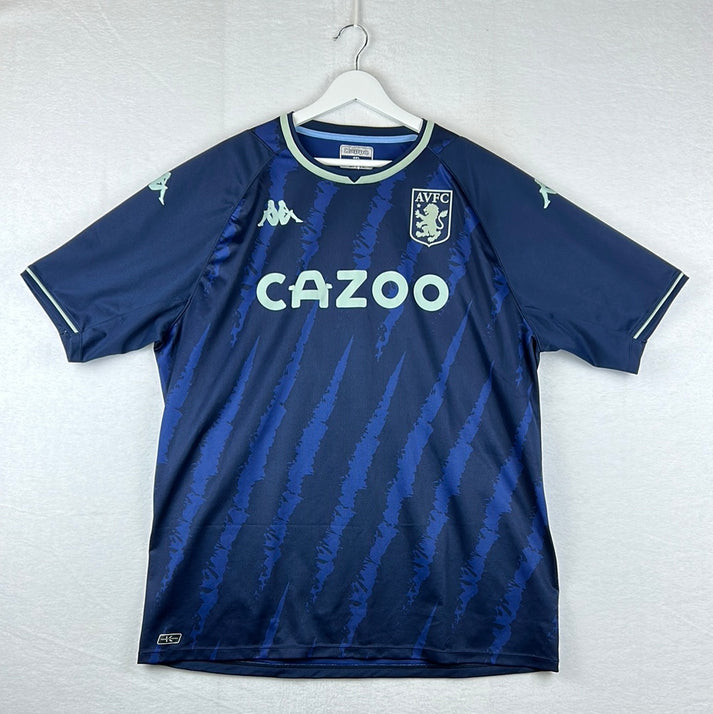
However, it is the away kit in 2021/22 that will probably go down as one of the most historical of Kappa’s reign, with it paying tribute to the 40th anniversary of Aston Villa’s 1-0 European Cup Final win over Bayern Munich. Like the shirt worn on that famous night, it is white with vertical claret pinstripes. On the reverse of the strip there is a claret band which includes the inscription of ‘1981-1982’.
2018 – 2019 – Luke 1977 / Fanatics
Following a breakdown between Villa and Under Armour, Birmingham based fashion house Luke 1977 and American sports apparel manufacturer Fanatics stepped in. It was agreed that Fanatics would manufacture the strips and manage the Villa Park store, while Luke 1977 created new products.
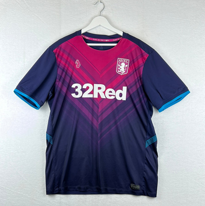
It was Luke 1977’s logo which featured on the simple, but effective kits and as a proud Aston Villa supporter it was a pride filled season for their Creative Director, Luke Roper. The brand has also been known as the club’s formalwear partner.
2016 – 2018 – Under Armour
Initially this deal was penned to last five years, but the pair cut ties after just two. Given the 2017/18 collection, it is quite a shame too, as the Villains donned two fine strips.
At home they wore a shirt in the club’s traditional claret and blue with the lion from their logo embossed in a small format throughout the base. On their travels, they had a black top with a pixelated claret strip going across the chest and through the club crest.
2012 – 2016 – Macron
Perhaps it was the polo-like collars, but the Macron and Aston Villa era had a very retro feel and look to it. The 2014/15 away strip exemplifies this as it is a modernised version of the 1981 to 1983 away top.
A home shirt worthy of a mention is the 2013/14 edition. It’s sides and sleeves were caped in sky-blue while its base was Aston Villa claret. The V-neck polo neckline incorporated horizontal claret and blue stripes, while the same colours hooped around the sleeves’ cuffs.
2007 – 2012 – Nike
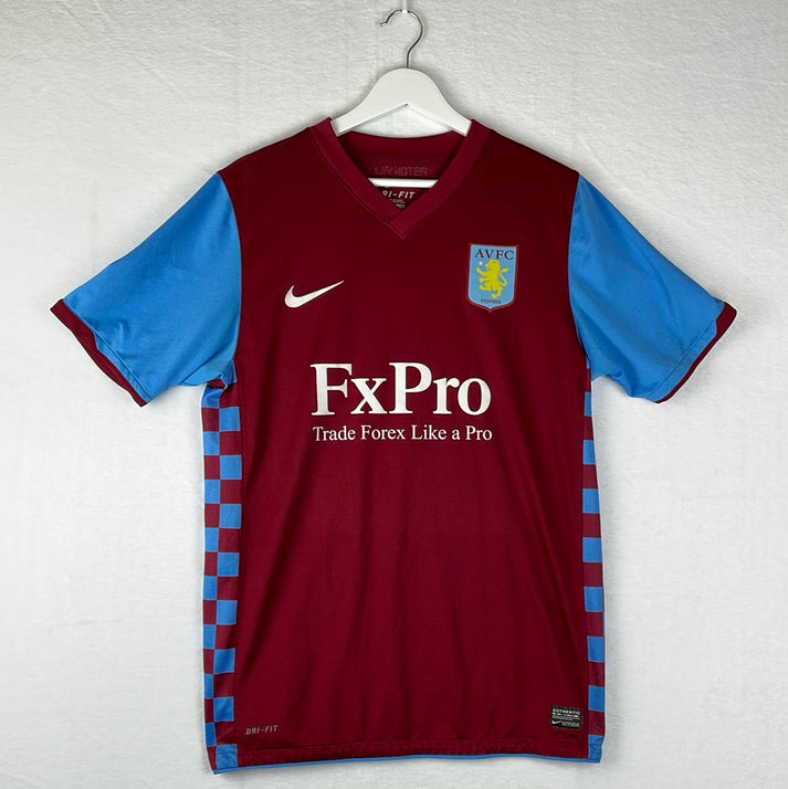
As four of the shirts from Nike’s Villa tenure contained a chequered pattern of sorts then I guess we can officially proclaim this period of time as the chequered era. The 2010/11 collection both had a chequered pattern running down its sides, while the 2011/12 home and away shirts were chequered in full.
Other than this, it was a fairly basic partnership design wise, but one interesting note is that in 2007/08, Nike did opt to bring back a blue Aston Villa outfield shirt for the first time since 2000/01.
2004 – 2007 – Hummel
The famous Hummel chevrons took their place on the Villains strips on each of the kits from this tenure, but perhaps not where you would expect to find them. On most kits, like in 2004/05, they are likely to feature across shoulders/arms, but in two of the three seasons working with the Villa Park club they featured on the sides.
2000 – 2004 – Diadora
The Diadora Aston Villa range has some absolute classics, with the whole of the 2000/01 collection and the 2002/03 away strip undoubtedly falling into that category.
For some, but not all, the 2001/02 away jersey will too, but admittedly it is a bit of a ‘marmite’ shirt. It was a silky silver centre badge polo design with navy and luminous green features.
1995 – 2000 – Reebok
Like Under Armour produced in 2018/19, Reebok imprinted the Aston Villa lion into the background of the 1995 – 1997 home top and the 1995/96 away shirt. The away strip also acted as the third kit in 1996/97. Reebok also ran a centre crest sash design in 1999/00 which is definitely worth checking out.
The manufacturer opted for various versions of their branding over these seasons with their logo featuring alone, simply the word ‘Reebok’ and both of them together being used.
1993 – 1995 – Asics
As well as produce the funkiest looking goalkeeping jerseys that you’ll ever see, Asics decided to give Villa an interesting green, red and black striped away shirt. Something that I don’t believe we saw before this and, other than their 2019/20 away strip, which has similar colourings, since.
1990 – 1993 – Umbro
The Aston Villa 1990 – 1992 home shirt and the 1990 – 1993 away are absolutely delightful, but they were perhaps deepened by a hideous yellow 1991 – 1993 third top that has a humongous Aston Villa crest embossed. It just doesn’t look well put together at all.
They redeemed themselves in 1992/1993 though, as Umbro took us all the way back with a remarkable laced neckline on the home shirt.
1987 – 1990 – Hummel
Interestingly, the design used on both of the shirts from 1987 until 1989 is similar to one being used by the brand today. See the 2023 Denmark, Werder Bremen, Malaga and Southampton kits to name a few.
Hummel also took a risk by switching the club’s traditional claret for more of a red.
1985 – 1987 – Henson
The same shirts were worn over two seasons with Henson and they were both V-neck with no club crest, as ‘AVFC’ was stitched in instead.
1982 – 1985 – Le Coq Sportif
Le Coq Sportif were the lucky manufacturers for the famous Aston Villa 1981/82 European Cup winning shirt and coincidentally, that was their first season together.
The 1983/84 shirt was the first time that the French brand’s branding featured on the chest, with it being placed on the arms prior to this.
1970 – 1981 – Umbro
Umbro were Villa’s first ever shirt manufacturing partner and throughout this period of time it was what you’d expect – basic polo designs. That said, they do make wonderful retro items.
Aston Villa Shirt Sponsor History
Flicking through, most of Aston Villa’s shirt sponsors have been fairly sound appearance wise, so let’s tell you a bit about them:
2023 – present – BK8
Betting brand BK8 have pledged to make a contribution per adult third shirt sold to a local charity in Birmingham as part of the deal with the club.
Their branding seems fine with a swirl and a crown around the eight adding some detail. The away and third shirt versions, where it is all one colour, do look nicer than the home, where it is two, though.
2020 – 2023 – Cazoo
Cazoo is a car retailer and within their branding the A was made to symbolise a vehicle. Up until their final year together, when a slogan was added underneath the brand name, it was a solid sponsorship appearance wise.
2019 – 2020 – W88
W88 is a betting and gaming company which is based in Asia. With all due respect, I think Villa supporters will be pleased this deal only lasted a single campaign as the large W above the W88 really does become an eyesore.
2018 – 2019 – 32Red
32Red is a multiple award-winning online casino. Their branding across the Villa shirts was simply ‘32Red’ in white text. Simple, but effective.
2017 – 2018 – Unibet
It appears Villa were on a tour of gambling companies as Unibet also had a dabble in 2017. Each letter of Unibet featured in its own circle, with some of them slanted. It admittedly looked quite cool.
2015 – 2017 – Intuit QuickBooks
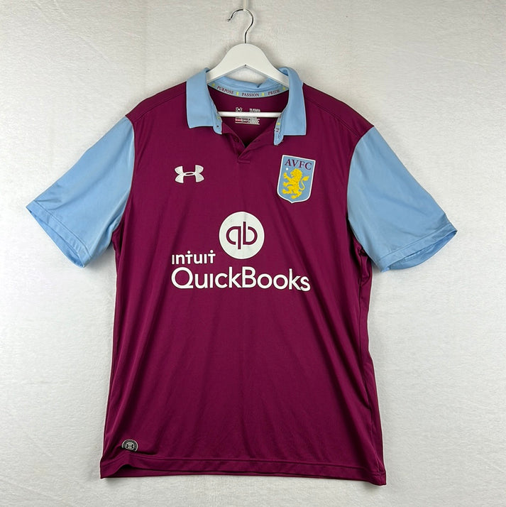
This is an online accounting software and unfortunately, for me, it just feels like the brand tried to cram too much into their feature. Just the text, without the logo, would have improved it tenfold.
2013 – 2015 – Dafabet
Dafabet is an online betting site and they headquarter in the Philippines. I like the text used for their branding, which I think is what saves the shirt from their logo.
2011 – 2013 – Genting Casino
Genting have a number of casinos splattered across the United Kingdom. There isn’t anything particularly wrong with their feature, it is just by no means the best option out there appearance wise.
2010 – 2011 – FxPro
FxPro proclaims to be the world’s number one online Forex broker. Their feature doesn’t look bad at all, I just have concerns about what kind of message the slogan ‘trade forex like a pro’ gives off.
2008 – 2010 – Acorns
Acorns’ feature is another one that was really basic, but it didn’t take anything away from the shirt, so that is a plus for me. Acorns is a financial technology and financial service.
2006 – 2008 – 32Red
Prior to 2018/19, 32Red had previous with the Villains, but in my opinion the design of the feature was nowhere near as good. As well as clubs, hearts, diamonds and spades, .com was also added.
2004 – 2006 – DWS Investment
DWS is a German company which specialises in asset management. Their feature was a nice non-overpowering one.
2002 – 2004 – MG Rover Group
MG Rover Group was a car manufacturing group based in the Midlands. They used the home shirt to promote ‘Rover’ in a simple, bland text, while they utilised the away strip to advertise ‘MG’ in its slick logo format.
2000 – 2002 – NTL:
NTL, now known as Virgin Media, provided cable television, cable internet and fixed-line cable telephone services. Their purple and green logo was definitely helped by the era of Villa shirts, but all in all, despite the randomness, it wasn’t too bad.
1998 – 2000 – LDV Vans
The LDV group is a local business, now Europe wide, that is headquartered in Birmingham. Their branding has changed since this and unfortunately their current format would look better.
1995 – 1998 – AST Computer
Featuring in all white with a line separating AST from the word computer, the computer manufacturer’s feature fitted in well and didn’t ruin the shirt in any sense.
1993 – 1995 – Müller
Müller is a well-known dairy brand and it is definitely one of the more recognisable names in this list. Unfortunately, though, given the red background, their feature did look a little stuck on, but it only appeared an issue on the home shirt.
1983 – 1993 – Mita
The club’s longest partnership has been with photocopier manufacturer Mita, who have since been acquired by Japanese firm Kyocera. Their branding was always straightforward white text.
1982 – 1983 – Davenports
The historic brewery, Davenports, got the honours of having the club’s first ever feature. With the simplicity of it, it was a nice introduction too.
Conclusion
Aston Villa have been lucky in the way of shirt designs, but they have shed through their fair share of shirt sponsors. Whether it’s their business model, I don’t know, but I dread to see their list in ten years time if they continue in this manner.
Vintage Shirts By Decade
-

1980s Football Shirts
Step back into one of football’s most iconic eras with our collection...
-

1990s Football Shirts & Iconic 90s Kits
Relive the era of bold designs, baggy fits and unforgettable sponsors with...
Popular Teams
-

Vintage Manchester United Shirts
Here's my current stock of Manchester United shirts that are for sale....
-

Vintage Arsenal Shirts
Step into true North London nostalgia with our collection of vintage Arsenal...
-

Vintage Chelsea Shirts
Celebrate the iconic eras of Stamford Bridge with our collection of vintage...
-

Vintage Barcelona Shirts
Immerse yourself in the rich tapestry of FC Barcelona with our stunning...
-

Lionel Messi Shirts
Shop authentic Messi shirts from his time at Barcelona, PSG, Argentina and...
-

Real Madrid Shirts
Step into a realm of royal elegance with our Real Madrid shirt...
Latest Stock
-
2019/20 Valencia Third Football Shirt (M) Puma #16 Kang In
Size: Medium
Regular price £70.00 GBPRegular priceUnit price per -
2020/21 Valencia Away Football Shirt (L) Puma
Size: Large
Regular price £50.00 GBPRegular priceUnit price per -
2021/22 Wolverhampton Wanderers Home Football Shirt (M) Castore #7 Neto
Size: Medium
Regular price £60.00 GBPRegular priceUnit price per -
2001/02 Arsenal Away Football Shirt (M) Nike
Size: Medium
Regular price £250.00 GBPRegular priceUnit price per -
2020/21 Atletico Madrid Third Football Shirt (S) Nike #9 Suarez
Size: Small
Regular price £75.00 GBPRegular priceUnit price per -
2013/14 Queens Park Rangers Third Football Shirt (M) Lotto (BNWTs)
Size: Medium
Regular price £65.00 GBPRegular priceUnit price per -
2019/20 Liverpool Home Football Shirt (S) New Balance #18 Minamino
Size: Small
Regular price £60.00 GBPRegular priceUnit price per -
2024/25 Cambridge United Third Football Shirt (S) Umbro
Size: Small
Regular price £50.00 GBPRegular priceUnit price per
Match Worn Shirts
-
Preston North End 2022/2023 Match Worn Shirt - A Fernandez
Size: 2
Regular price £299.99 GBPRegular priceUnit price per -
Manchester City 2025-2026 Match Worn Home Shirt
Size: M
Regular price £299.99 GBPRegular priceUnit price per -
1986/87 Denmark Home Football Shirt (XL) Hummel #10 (Elkjaer) Re-Issue
Size: X-Large
Regular price £55.00 GBPRegular priceUnit price per -
2020/21 Cambridge United Home Football Shirt (M) Hummel #23 Knowles (Matchworn / Signed)
Size: 1
Regular price £70.00 GBPRegular priceUnit price per
