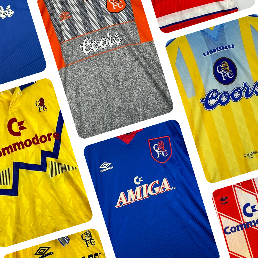
Blackburn Shirt History
Blackburn Rovers, who are founding members of the English Football League, are famously one of only seven clubs to have won the Premier League since its inception in 1992. Let’s delve right into their kit manufacturing and sponsorship history…
Blackburn Rovers Kit History - Checklist

Blackburn Rovers Kit Manufacturing History
2021 – present – Macron
It is a non-negotiable that Blackburn will wear a blue and white halves concept at home, but there are still ways to keep things interesting, as Macron have shown since 2021.
The Blackburn club crest is heavily influenced by their county with the Lancashire rose being front and centre of it. Macron bought into this in 2021/22 and released a home and away jersey heavily influenced by it – a jacquard version of the rose was placed towards the bottom left of both strips. In the same season, the Italian brand supplied a yellow third top in tribute to their 1991/92 Championship play-off final win over Leicester.
Tonal imprints of the Lancashire Rose also appeared several times across the red base of the 2022/23 third kit, and, as on all of the shirts that campaign, it also had the club’s motto ‘Arte et Labore, which means ‘By Skill and Labour’, printed nicely onto the back of its neck.
‘Rovers FC’ was embossed into the 2023/24 home top throughout its blue left half and blue right sleeve and it strikingly also had a neckline feature utilising a lighter shade of blue. The eye-catching lime green and light blue third top from this season was inspired by the metal framework of Ewood Park.
2016 – 2021 – Umbro
Umbro opted for a ‘Cambridge’ tone of blue in 2018/19, a colour which the club first used back in the 1880’s. It went down as a popular jersey and it was topped off with grey Umbro crests consecutively looping around its sleeve cuffs.
For three of the campaigns, Umbro chose to throw several red touches on to the Rovers home jersey and, although it has been seen plenty of time over the years, it was quite fitting given that they were the first manufacturer to do this back in the 1970’s.

Umbro provided a fair few notable alternate jerseys with the first coming in the very first year of this partnership. Things kickstarted with a fine black away top which had a small blue and white sash on its upper left chest.
In the following season, 2017/18, the double diamond brand took influence from the 90’s and went for a black and red vertically striped design. Another 90’s inspired jersey was the 2020/21 red away top which had an intriguing blue graphic on its chest and shoulders.
The boldest designs came in 2019/20, with both the away and third jersey capturing the eye. The away top was grey with a tonal pattern only on one half in an attempt to mask the concept seen on a Rovers home strip. The third top was a dark navy and it was paired with black chequers on its left side which ran onto its base, but stopped just before the club crest.
2013 – 2016 – Nike
Nike also used a lighter shade of blue on the base of the 2014/15 home top and it looked really smart alongside its navy crewneck neckline and sleeve cuffs. A home strip with thin red side panels followed in 2015/16.
A stunning turquoise and navy away strip was also worn in 2014/15 – it had a smart polo collar and an eye-catching monochromatic club crest.
2007 – 2013 – Umbro
A brilliant example of red on a Blackburn home strip came in 2009/10. On that occasion, red was used within its neckline, sleeve cuffs and across its lower trim. Umbro also utilised red in 2011/12, however the whole of that collection will not be fondly remembered due to it marking the start of a Premier League absence which has now surpassed a decade. Their Championship stay begun with an impressive home top which boasted a smart, classical V-neck neckline.

The alternate shirts throughout this era were quite bland compared to other periods, however it did house one particularly decent away jersey in 2008/09 – it had a conjoined blue and white stripe running centrally down its navy base.
2004 – 2007 – Lonsdale
Respectively, the Lonsdale and Blackburn partnership didn’t produce any real fantastic jerseys. It was quite a strange period, which is exemplified by the red and grey combination on the 2006/07 away top.

2000 – 2004 – Kappa
Kappa’s years of responsibility were fairly successful, both on and off the pitch, and it all started with Premier League promotion in 2000/01. They earned promotion while wearing a home top with thick navy sides, however, it was replaced for a 1-0 win against Wolves by a classical looking 125th anniversary shirt which included commemorative stitching. The landmark top was sold to supporters in a special box.
It seemed the 2000/01 home and away jersey oozed success, with them both being part of the 2001/02 collection which the club wore to win the League Cup.
Prominent navy features also appeared on the 2002/03 home top, although this time they stood out even more with them being outlined by a red trim. Good or bad, the memories attached to it will be fond ones given their sixth place Premier League finish and their participation in the UEFA Cup.
For a second successive season, Blackburn also competed in Europe in 2003/04 and Kappa released a European home jersey which paraded a central club crest. Kappa’s branding was placed on its sleeves.
1998 – 2000 – Uhlsport
Each Uhlsport jersey supplied across these two seasons utilised the central club crest concept and it made for three brilliant retro designs.
The home and away top may have had two different interpretations of a polo collar, but they both featured the same tonal print which included the phrase ‘We Believe in Football’ and ‘Blackburn Rovers FC’. The yellow away strip was particularly striking given it boasted an uneven blue broken stripe pattern.
A third kit was released for the 1999/00 campaign and it is a fantastic vintage concept. It was navy with a red sash that was made up of several embossed Blackburn club crests.
1992 – 1998 – Asics
Asics were the suppliers of the most famous collection in the club’s history given they were crowned Premier League champions in 1994/95. The home top adorned a lovely cotton polo collar and it had the club’s motto elegantly stitched into its sleeves. The away top saw a spacious thin red and black stripe concept, while the third strip paired black and yellow.
They boasted their champions status, and rightly so, in 1995/96 and it made for two nice collectors’ items for supporters. The home kit was designed the same as the 1994/95 edition, however it had gold commemorative stitching beneath the club crest acknowledging the achievement. The away jersey was less subtle about it – it was red with black sleeves and it had a huge Premier League champions emblem imprinted on an angle on its front.
On the pitch success may have cooled in 1996/97, but the away kit ensured that they couldn’t have been forgotten about.

It was yellow with a navy overlapping Blackburn crest pattern on its left arm and right side. The home top accompanying it had a stylish grandad collar with a tonal print including ‘Arte et Labore’. That home kit remained in place for 1997/98, but the away shirt was swapped for an orange one, a colour you don’t usually associate with the club.

1990 – 1992 – Ribero
Ribero opted for the lighter tone of blue on the home strip in 1990/91 – it was a real eye-catching top given its solid red polo collar and sponsorship features. The succeeding home jersey ditched the red for a half blue, half white collar. Both of the Ribero away kits were yellow, but the final one had more prominent blue features than the first.
1988 – 1990 – Ellgren
Nowadays, Ellgren is more popular in the world of rugby. The Rovers wore the same home and away jersey for both campaigns and they both incorporated the same tonal background pattern.
1981 – 1988 – Spall
For all of the Spall campaigns, Blackburn donned the same home top which had a classical red V-neck neckline. A smart yellow and blue pinstriped top was worn away for a majority of the deal.
1974 – 1981 – Umbro
As aforementioned, not only were Umbro the clubs first kit manufacturer but they are also the pioneers of red touches to the home jerseys. They did this for the first time in 1977/78.
Blackburn Rovers Shirt Sponsorship History
Blackburn wouldn’t have been short of offers throughout the 90’s and early 2000’s, but let’s see who they went with…
2022 – present – Totally Wicked
Controversially, Blackburn are currently in partnership with Totally Wicked, a vaping brand, and it has even caused outrage in parliament.
The pairs relationship officially started in 2018, when Totally Wicked agreed to sponsor the training gear.
2020 – 2022 – Recoverite
Performance and recovery brand, Recoverite, took the slot for two seasons, however the club claims it is a deal that never reached its full potential due to COVID.
2018 – 2020 – 10Bet
10Bet is an online sports betting firm and their feature, which consisted of a one and zero conjoined with the word bet running through the zero, was rather overpowering. It just looked too big.
2015 – 2018 – Dafabet
Fellow betting company, Dafabet, went before 10Bet and unfortunately this feature wasn’t too appealing either.
2014 – 2015 – Zebra Claims
Zebra Claims had a text-based feature, barring the zebra head which replaced the R, and it actually looked quite cool. Zebra Claims specialised in all legal claims, but particularly noise induced hearing loss.
2013 – 2014 – Regulatory Finance Solutions
RFS, which stood for Regulatory Finance Solutions, is a firm which provides finance consulting services.
2012 – 2013 – PROBIZ
The then owner of PROBIZ, a wealth management and accountancy firm, was born in Blackburn.
2011 – 2012 – The Prince’s Trust
The club opted to donate the slot to The Prince’s Trust for the 2011/12 campaign. Part of the deal saw Blackburn committing to fundraise for the charity throughout the season. The Prince’s Trust aims to help young people from disadvantaged communities.
2008 – 2011 – Crown Paints
Crown Paints is a major paint manufacturer based in Lancashire. The feature consisted of their recognisable branding.
2006 – 2008 – Bet24
The eyesore branding of Bet24, a gambling company which headquarters in Malta, appeared on the jerseys for two years.
2005 – 2006 – Lonsdale
As well as manufacturing the jersey, Lonsdale also sponsored it for the 2005/06 campaign. Despite it being a text-based feature, something about it just made it seem a little tacky…
2003 – 2005 – HAS
HSA, a health plan provider, had minimal branding. The first feature included their thought-provoking motto of ‘health-wise, it pays’.
2002 – 2003 – AMD
AMD specialises in computer processors. The away jersey looked fine, but their branding was placed on a white background on the home top and it was a big negative…
2000 – 2002 – Time Computers
Computer retailers Time Computers were based near rival-town Burnley. Unfortunately, they defunct in 2005. On a green background, their feature was the word time with a graphic of a computer component alongside it – it wasn’t great.
1996 – 2000 – CIS
CIS stood for Co-operative Insurance. They paraded a branded all-text feature.
1991 – 1996 – McEwan’s Lager
The text-based branding of McEwan’s, a beer brand which originates from Scotland, took over from 1991 until 1996. In September 1992, Coors appeared on the jersey for one game against Nottingham Forest instead.
1984 – 1991 – ICI Perspex
ICI means Imperial Chemical Industries and for this partnership the company’s role in developing acrylic plastic, Perspex, was boasted. They were the first industry to sponsor the club.
Conclusion
Understandably given the club’s success, the jerseys released between the 90’s and early to mid-2000’s are highly sought-after. The club is beginning to wear some solid designs once again under Macron, but it would be nice to see them step away from a vaping brand as shirt sponsor due the controversies surrounding it.
Vintage Shirts By Decade
-

1980s Football Shirts
Step back into one of football’s most iconic eras with our collection...
-

1990s Football Shirts & Iconic 90s Kits
Relive the era of bold designs, baggy fits and unforgettable sponsors with...
Popular Teams
-

Vintage Manchester United Shirts
Here's my current stock of Manchester United shirts that are for sale....
-

Vintage Arsenal Shirts
Step into true North London nostalgia with our collection of vintage Arsenal...
-

Vintage Chelsea Shirts
Celebrate the iconic eras of Stamford Bridge with our collection of vintage...
-

Vintage Barcelona Shirts
Immerse yourself in the rich tapestry of FC Barcelona with our stunning...
-

Lionel Messi Shirts
Shop authentic Messi shirts from his time at Barcelona, PSG, Argentina and...
-

Real Madrid Shirts
Step into a realm of royal elegance with our Real Madrid shirt...
Latest Stock
-
2007/09 England Home Football Shirt (2XL) Umbro #8 Lampard
Size: 2XL
Regular price £60.00 GBPRegular priceUnit price per -
2016/17 Wales Away Football Shirt (L) Adidas #11 Bale
Size: Large
Regular price £75.00 GBPRegular priceUnit price per -
1998/00 Brazil Home Football Shirt (2XL) Nike #9 Ronaldo
Size: 2XL
Regular price £140.00 GBPRegular priceUnit price per -
2006/07 Holland Away Football Shirt (L) Nike #10 Van Der Vaart
Size: Large
Regular price £80.00 GBPRegular priceUnit price per -
2018/19 Wales Away Football Shirt (XL) Adidas #11 Bale
Size: X-Large
Regular price £60.00 GBPRegular priceUnit price per -
2024/25 France Home Football Shirt (XL) Nike #10 Mbappe (BNWTs)
Size: X-Large
Regular price £80.00 GBPRegular priceUnit price per -
2002/04 Japan Home Football Shirt (L) Adidas #9 Nishizawa
Size: Large
Regular price £90.00 GBPRegular priceUnit price per -
2018/19 Portugal Away Football Shirt (L) Nike #7 Ronaldo
Size: Large
Regular price £75.00 GBPRegular priceUnit price per
Match Worn Shirts
-
Preston North End 2022/2023 Match Worn Shirt - A Fernandez
Size: 2
Regular price £299.99 GBPRegular priceUnit price per -
Manchester City 2025-2026 Match Worn Home Shirt
Size: M
Regular price £299.99 GBPRegular priceUnit price per -
1986/87 Denmark Home Football Shirt (XL) Hummel #10 (Elkjaer) Re-Issue
Size: X-Large
Regular price £55.00 GBPRegular priceUnit price per -
2020/21 Cambridge United Home Football Shirt (M) Hummel #23 Knowles (Matchworn / Signed)
Size: 1
Regular price £70.00 GBPRegular priceUnit price per
