Brighton And Hove Albion Shirt History
From being on the brink of liquidation in the 90’s to European nights in 2023, it has been quite a turn around for Brighton & Hove Albion over the last 20 years or so. Let’s delve into the shirt manufacturing and sponsorship deals that they have endured along the way.
Brighton Shirt History Checklist
From 1990 onwards -
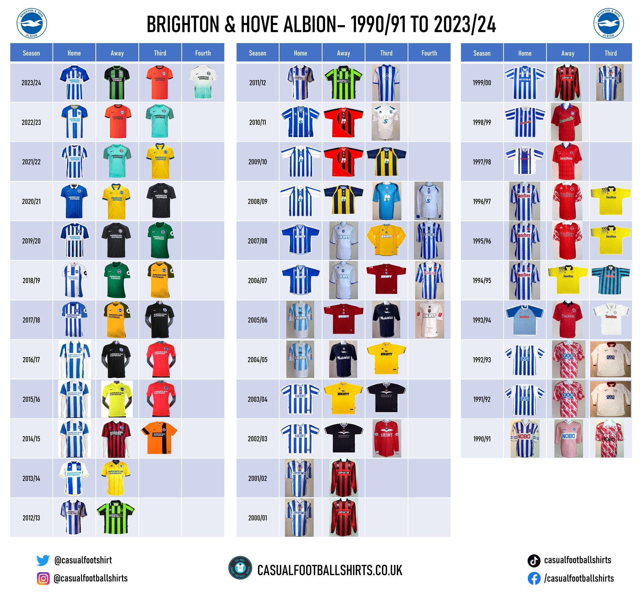
Brighton & Hove Albion Kit Manufacturer History
2014 – Present – Nike
Nike have been paired with Brighton since 2014/15 and they have been part of a fruitful era in the club’s history.
One of the most historic Nike collections is the 2016/17 range, given the Seagulls ended their 34-year absence from England’s top flight that campaign. Funnily enough, it is claimed that the home strip wore that season actually took inspiration from the 1979/80 home top, which was the last time they earned promotion from the second division prior to then. Alongside it, they wore a black polo away shirt that had yellow details and a crimson third top that featured spaced out tonal pinstripes.
More on the pitch success means that the 2022/23 range is just as iconic with the club earning qualification to a European competition for the very first time. It is quite fitting that the 2022/23 campaign now has some history behind it, because home jersey that season was a solid design. Brighton’s usual blue and white stripes were broken up by yellow pinstripes. Yellow also filled its neckline and sleeve cuffs.
Brighton fans were seemingly disappointed when the home shirt that was joining them on their Europa League travels was released, however the blow was probably softened when Nike announced a special, limited edition Europa League strip to commemorate the achievement of their participation. The crewneck strip is white on its top half but it turns turquoise towards its bottom, where it celebrates the city’s culture with a printed illustration of the Royal Pavilion – a building that was originally constructed as the seaside pleasure palace of King George IV. Another positive move made by Nike for the 2023/24 season was the fact they brought back a popular, modernised green and black away top that was last worn in 2012/13.
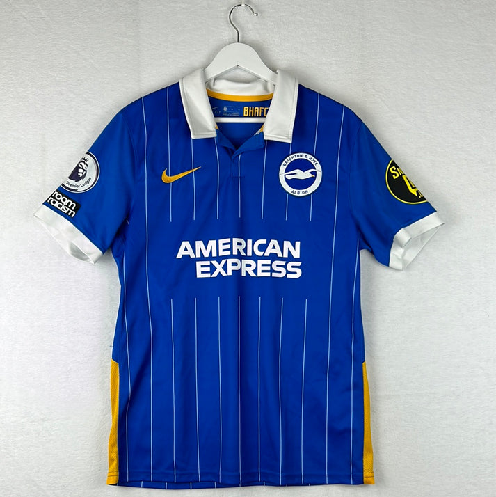
The 2020/21 home jersey may not have the same iconic memories behind it as the aforementioned strips but the design is one of the best of this partnership. It saw the Seagulls break away from their traditional thick white stripes with Nike applying thin white pinstripes instead. It had a real classy feel to it with its white polo neck collar.
1999 – 2014 – Errea
Unusually, Errea produced two Brighton home shirts in the first of their fifteen seasons as manufacturers. Until January 2000, the Seagulls wore classy polo home strip that probably deserved more limelight, before switching to a kit that commemorated their 100 years of existence. It also had a polo collar, but it was a central crest shirt that displayed the clubs first ever emblem and it had stitching acknowledging the landmark below it. Another feature of the commemorative shirt, which was actually used as the club’s home top until the end of the 2001/02 campaign, was that it had seagulls embossed into the blue stripes. This shirt sparked a long period of where all Brighton home jerseys were central crest designs, in fact, until 2009/10, most alternate strips followed the same concept.
From 2004 until 2006, the Albion wore a home shirt that featured a lighter shade of blue than we are perhaps used to, albeit it wasn’t the most striking strip from this era. A jersey that is in contention for that crown is the 2010/11 home top – it had a classy looking V-neck neckline and its blue stripes were much thicker than the white ones. Brighton won the League One title while donning it. Another talking point from this campaign is that the goalkeeping strips had a large, Spiderman inspired, spider imprinted into the centre of them.
All in all, Errea produced two fantastic designs in the 2011/12 season, including the aforementioned beloved green and black striped away top, however, the most historic shirt used within that season is a sponsor-less commemorative strip that celebrated the opening of their new, and current, home, The Amex Stadium.
1997 – 1999 – Super League
Brighton donned the same red away top that was imprinted with diamond chequers and paired with a mostly blue collar for both of these campaigns. The diamond print followed onto both home strips supplied, with the 1997/98 design being a little less traditional – instead of conventional blue and white stripes the whole way through, it only had two of those with one large blue stripe breaking them up in its centre. The 1998/99 edition had blue and white pinstripes either side of its traditional stripes.
1994 – 1997 – Admiral
As well as a traditional home top embossed in Admiral logos, a yellow alternate strip, which was used as an away top for one campaign and a third top for two, also survived the whole of this partnership. Its yellow base, which was paired with a black polo collar, also had black race flag chequers on its right sleeve and shoulder. For two seasons, Admiral also provided Brighton with a red away top that had a distinct white pattern on its sleeves.
1991 – 1994 – Ribero
The final home shirt that Ribero produced was quite unorthodox. Its base was filled with close blue and white pinstripes, while its sleeves were a solid blue with pinstriped cuffs.
Speaking of unorthodox, the away jersey utilised from 1991 until 1993 was also that – it was unusually patterned red and white and it is widely known across the Seagulls fanbase as the ‘blood shirt’. It has a bit of history behind it, given that, barring a few small tweaks, it was actually originally released by Sports Express and used as a special shirt for the Second Division 1990/91 play-off final, which Brighton lost 3-1 against Notts County.
1989 – 1991 – Sports Express
It wasn’t just the ‘blood shirt’ that Sports Express released with an unusual red and white pattern, as the abstract 1989 until 1991 away top followed suit. The fairly traditional home jersey from this era had a lovely touch with two blue hoops running around its sleeves and they were broken up by a Brighton crest.
1987 – 1989 – Spal
Design wise, Spal had a fairly uneventful time as Brighton’s manufacturers, however that doesn’t mean that the shirts were bad looking – they weren’t. The away kit was particularly smart with its tonal yellow stripes being paired with a blue collar and sleeve cuffs.
1980 – 1987 – Adidas
The Adidas Originals shirts from this period looked fantastic, although, they interestingly never opted for the traditional blue and white stripes in their usual format.
For the first three seasons, both the home and away jersey had solid bases with V-neck polo collars, so it wasn’t until 1983/84 when things started to get a little ‘jazzy’. The home top released in that year, which remained until 1985, had a blue base with white and red pinstripes running vertically. The away strip, which was in place for the same amount of time, was alternatively white with red and blue pinstripes.
Brighton wore, of course, blue at home but red away from 1985 until 1987, and both of them had spaced out horizontal pinstripes running from the stomach area downwards. On there top half, they had traditional horizontal stripes running across the shoulder area.
1977 – 1980 – Bukta
Other than switching from a navy away kit to a yellow away kit from 1978/79 onwards, there isn’t a great lot to discuss about these minimal designs. Something noteworthy may be that Bukta didn’t place their logo in the common sponsorship slot on any of the shirts, they instead put their name there and had their emblem running consecutively down the sleeves.
1975 – 1977 – Umbro
Umbro had a spell with the club in the 70’s, but at this stage the Brighton crest didn’t even appear on the shirts. The stripes on the home shirt had slightly zigzagged edges. They also produced a plain green away kit and a plain red away top.
1974 – 1975 – Admiral
Admiral were the first manufacturing brand to partner with the Albion and they provided an all-white home shirt barring its blue crewneck collar. Again, there was no Brighton crest present.
Brighton & Hove Albion Shirt Sponsorship History
There’s some noteworthy history about some of Brighton’s front of shirt sponsors, so let’s get right into it…
2013 – present – American Express
American Express is a bank holding company and they have really ‘gone to town’ with their sponsorship of the Seagulls as they have also secured naming rights of their stadium and training complex.
Their feature on the shirt is simply text-based with nothing to dislike and they deserve their props for allowing the club to sell a version of their 2019/20 home shirt that was dedicated to the NHS. In the usual sponsorship slot, it read ‘Thank You NHS’ on a blue background and on its sleeve, it said ‘Thank You Key Workers’ in a white circle.
This wasn’t the first time that American Express had done this, as they agreed for the club to wear a version of their shirt which paid tribute to 25 years of Albion in the Community in 2015/16.0
2011 – 2013 – Brighton And Hove Jobs
Brighton And Hove Jobs is an award-winning jobs board and recruitment solution. There can’t be too many complaints about their feature, as it was simply their URL and a small logo.
2008 – 2011 – IT First
A company named IT First struck a deal for three years from 2008. On this feature, ‘IT’ was printed in white but the letters were overlapped by a large blue ‘S’. It wasn’t particularly nice on the eye.
1999 – 2008 – Skint Records
Skint Records is a Brighton and Hove based dance music record label. For most of the nine-year partnership, it was simply the word ‘Skint’ that was printed in various fonts and sometimes with a background, but it never once made the shirt unattractive.
Between 2004 and 2006, Skint Records used a navy alternate strip to promote Palookaville, which is the fourth and final studio album produced by English music producer Fatboy Slim. The album was later nominated for the 2006 Grammy Award for Best Electronic/Dance Album.
1998 – 1999 – Donatello
Donatello is an Italian restaurant situated in Brighton and it has been part of their community for over 40 years. It is thankfully still serving to this day and they had a text-based feature on the shirts. The font colour was red on the home top but green on the away shirt.
1993 – 1998 – Sandtex
One of the UK’s leading paint brands, Sandtex, saw their name at the front and centre of a Brighton shirt from 1993 until 1998.
1991 – 1993 – TSB Bank
TSB Bank is a British retail and commercial bank that headquarters in Edinburgh. Their recognisable branding appeared for two campaigns. Despite it being blue on blue, it complimented the home shirt quite well.
1986 – 1991 – Nobo
Nobo specialises in selling office products. Their all text feature didn’t look bad at all, but there are stories of how rivals would mock the partnership by claiming it stood for ‘Nobody supports Brighton’.
1983 – 1986 – Phoenix Brewery
Phoenix Brewery took the slot for three years and their text-based feature was only the second front of shirt sponsor in Brighton history.
1981 – 1983 – British Caledonian Airways
Unfortunately, British Caledonian Airways ceased in 1988. They were a British private independent airline which operated out of London Gatwick Airport during the 1970s and 1980s.
Noticeably, their away shirt only read ‘British Caledonian’, whereas the home shirt stated ‘British Caledonian Airways’.
Conclusion
It is rare that we get through a shirt history article without mentioning a gambling company, so you do wonder whether Brighton have purposefully steered clear of those. The best word to describe the shirt designs since 1974 would be steady – nothing terrible, but nothing spectacular.
Vintage Shirts By Decade
-

1980s Football Shirts
Step back into one of football’s most iconic eras with our collection...
-

1990s Football Shirts & Iconic 90s Kits
Relive the era of bold designs, baggy fits and unforgettable sponsors with...


Popular Teams
-

Vintage Manchester United Shirts
Here's my current stock of Manchester United shirts that are for sale....
-

Vintage Arsenal Shirts
Step into true North London nostalgia with our collection of vintage Arsenal...
-

Vintage Chelsea Shirts
Celebrate the iconic eras of Stamford Bridge with our collection of vintage...
-

Vintage Barcelona Shirts
Immerse yourself in the rich tapestry of FC Barcelona with our stunning...
-

Lionel Messi Shirts
Shop authentic Messi shirts from his time at Barcelona, PSG, Argentina and...
-

Real Madrid Shirts
Step into a realm of royal elegance with our Real Madrid shirt...


Latest Stock
-
West Ham United 2020/2021 Third Football Shirt Medium
Size: Medium
Regular price £49.99 GBPRegular priceUnit price per -
Wales 2022/2023/2024 Home Football Shirt Medium
Size: Medium
Regular price £49.99 GBPRegular priceUnit price per -
Wales 2022/2023/2024 Home Shirt Medium BALE 11
Size: Medium
Regular price £59.99 GBPRegular priceUnit price per -
Portsmouth 2023/2024 Home Shirt 3XL BNWT
Size: 3XL
Regular price £59.99 GBPRegular priceUnit price per -
Wales 2022/2023/2024 Home Shirt Large
Size: Large
Regular price £49.99 GBPRegular priceUnit price per -
Sunderland 2016/2017 Third Shirt Medium
Size: Medium
Regular price £39.99 GBPRegular priceUnit price per -
Port Vale 1994/1995 Away Shirt Large
Size: Large
Regular price £149.99 GBPRegular priceUnit price per -
Leicester City 2024/2025 Goalkeeper Shirt Medium
Size: Medium
Regular price £39.99 GBPRegular priceUnit price per


Match Worn Shirts
-
England Player Issue 2024 Home Shirt - v Denmark - Bellingham 10
Size: L
Regular price £349.99 GBPRegular priceUnit price per£99.99 GBPSale price £349.99 GBP -
England 1992 Player Issue Third Shirt
Size: 3
Regular price £399.99 GBPRegular priceUnit price per -
2024/25 Cambridge United Home Football Shirt (M) Umbro #45 Longelo (Signed | Match Issue)
Size: 0
Regular price £75.00 GBPRegular priceUnit price per -
Lisburn Distillery 2022-23 Match Worn Away - Size L (M Fit) - #19
Size: 0
Regular price £34.99 GBPRegular priceUnit price per


