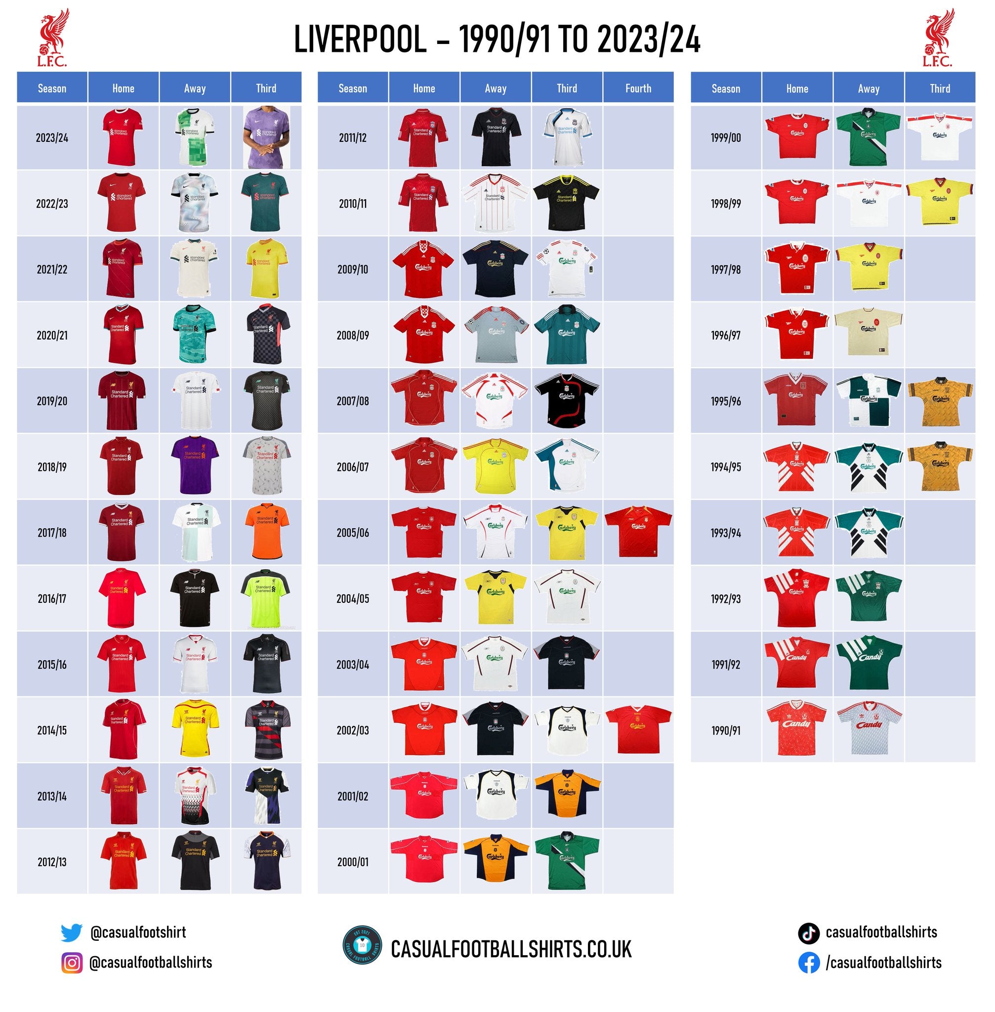
Liverpool Football Shirt History
Liverpool red is universally recognisable – let’s take a look at some of their famous strips.
Quick links
Shirt history checklist | Goalkeeper shirts | Kit manufacturers | Shirt sponsors
Liverpool kit manufacturers
- Nike (2020–present)
- New Balance (2015–2020)
- Warrior (2012–2015)
- Adidas (2006–2012)
- Reebok (1996–2006)
- Adidas (1985–1996)
- Umbro (1973–1985)
Liverpool shirt sponsors
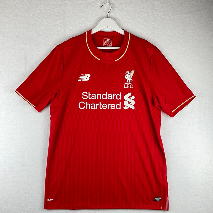
- Standard Charter (2010–present)
- Carlsberg (1992–2010)
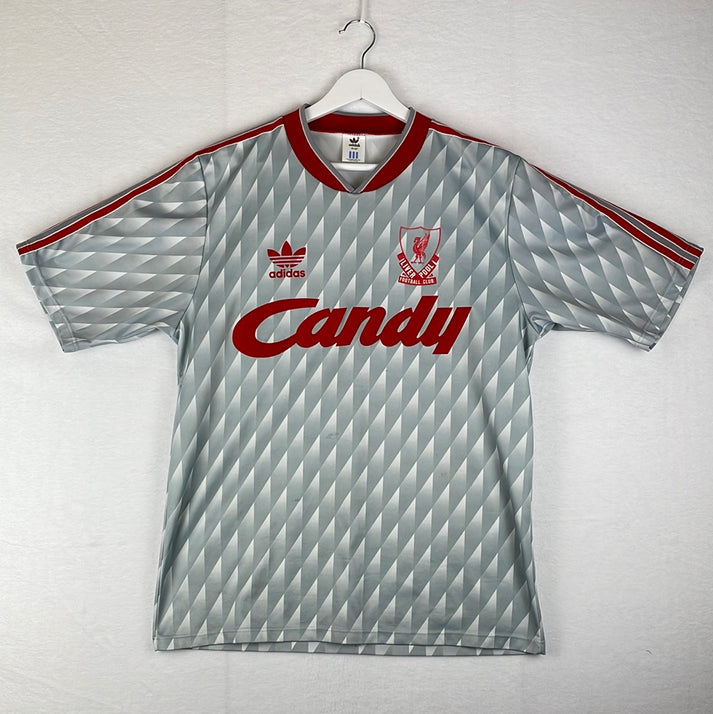
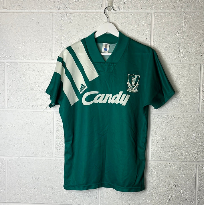
- Candy (1988–1992)
- Crown Paints (1982–1988)
- Hitachi (1979–1982)
Liverpool Shirt History - Downloadable Checklist
Liverpool Goalkeeper Shirt History Checklist

Liverpool Kit Manufacturer History
2020 – present – Nike
For the 2020/21 season, Nike kickstarted their chapter with the club with a smart, but simple home strip that included some representation of the where they are based. The teal across the collar and within its sleeve cuffs is inspired by the colours of the famous Liver Bird, a mythical creature which sits at the top of the Liver Building and is a symbol for the city. The American brand followed this with a home shirt that featured tonal diagonal zigzagged stripes, but the rest of the home jerseys are only separated by subtle differences.
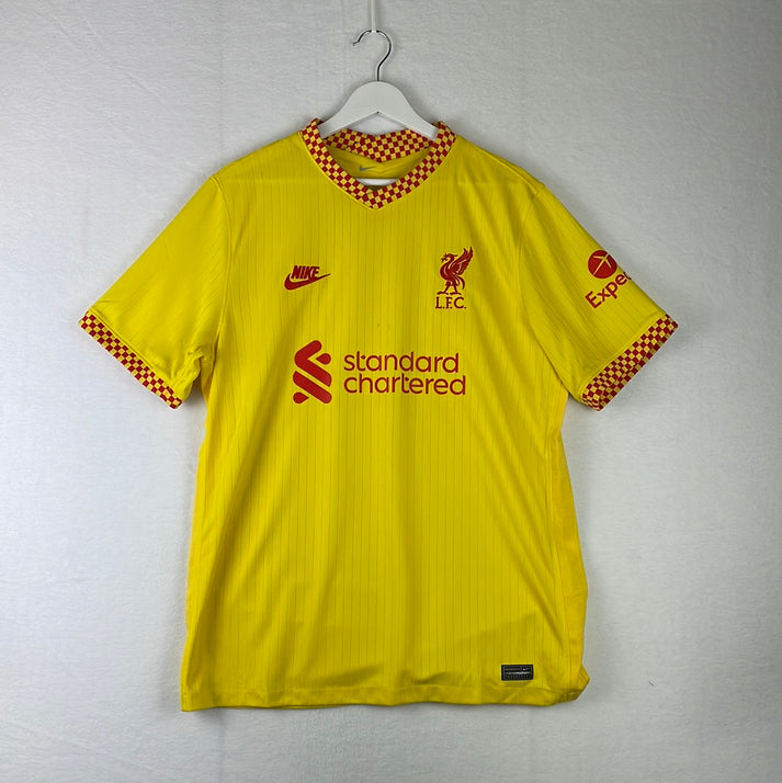
Away and third shirts are where Nike have thrived so far throughout this deal, with a number of noteworthy designs. The away kit in 2020/21 was the first of such, as the ‘hyper turquoise’ jersey was caped in an abstract graphic which was inspired by the Shankly Gates. They followed this up in 2021/22 with a smart polo design which was an off-white with dark teal and crimson features – a design the club claims ‘epitomises the rich history of the city’. Their away strip in 2023/24 is split into four quarters with two being green and two being white. It is a remake of the Adidas 1995/96 away top but with a couple of differences, such as pixelated edges and a lighter tone of green. The third shirt for this campaign is also striking, as it is made up of both light and dark purple.
2015 – 2020 – New Balance
The 2019/20 New Balance collection will be forever in lights and will no doubt be sought after for many, many years to come. 2019/20 saw the Reds lift the Premier League trophy for the first time in their history, ending a league title trophy drought dating back to 1989/90. Fittingly, Liverpool used the shirts from this campaign to pay tribute to the late Bob Paisley, the clubs most successful manager since their birth. All of the jerseys from this campaign are inscribed with his signature on the inside of the neck. Furthermore, the white pinstripes on the home top are a tribute to his 1882/83 title winning campaign, and the collar shape on their white home strip pays homage to his 1977 European Cup winning side.
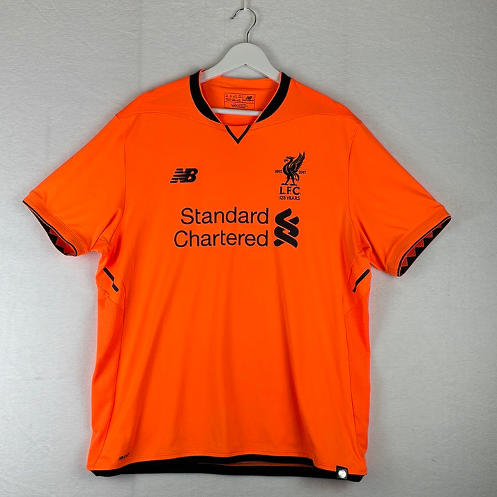
In 2017/18, New Balance had the pressures of commemorating the clubs 125th anniversary. The shirts this campaign featured both ‘1892’ and ‘2017’ on either side of the club crest and ‘125 years’ underneath it. The home shirt was a historical rich, dark Liverpool red, while the away was New Balance’s own version of the aforementioned 1995/96 away top. In this version, the green sections were made up of pinstripes instead of solid green. A limited-edition version of the away shirt was also produced, but this time blue pinstripes replaced the green ones, marking clubs first ever colours.
A green shirt that New Balance arguably got wrong came in 2016/17. It is illuminous green with dark grey shoulders and upper sleeves. Separating the grey from the green is a white colour block running across the jersey.
2012 – 2015 – Warrior
Liverpool is the only English club that Warrior has partnered with and the designs produced during this period are quite telling as to why. In fact, the appearance of some of the shirts are one reason why parent company New Balance took over the deal from 2015.
In truth, the home jerseys that were churned out weren’t that bad, but there were definitely some questionable away and third strips. One of the shirts that raised a few eyebrows was the 2014/15 third kit. It was black with dark grey hoops, but that was broken up by part of the hoops being red to create some kind of broken sash. Its polo collar was also red.
2006 – 2012 – Adidas
This was Adidas’ second partnership with the Reds and after a successful first deal, you can forgive Liverpool fans if they expected a lot of it. Although, comparing it to their first, the German brand probably undelivered, but it was far from disastrous.
An interesting note to make about the first four seasons of this deal is that Adidas opted to place their own logo centrally. This didn’t necessarily have a negative impact on the designs, with the home shirts worn from 2006 until 2010 being well liked.
The subtly chequered silvery grey 2008/09 away kit is one that is appreciated across the fan base. With Adidas’ branding, half of the neckline and the sleeve cuffs being red, it has a unique feel to it. Although, it is probably more favourited because of their famous 4-1 win at Old Trafford.
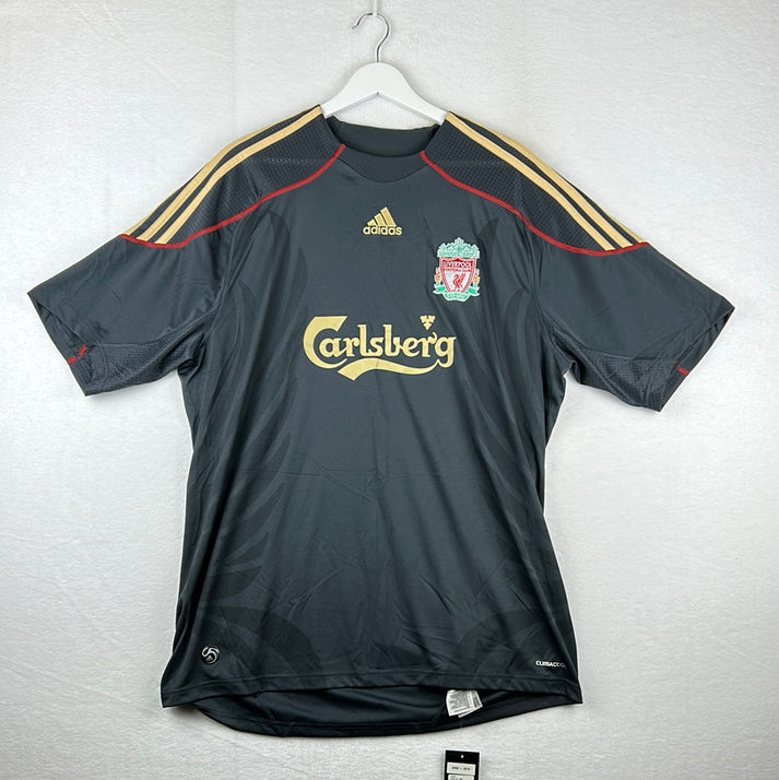
Another worthy of making a note of is 2011/12 away top – a season in which they reached the FA Cup final and won the League Cup. The shirt was black with grey pinstripes and it also had red features to its sides, collar and sleeve cuffs. The Liverpool emblem was nicely done, as it was ‘silvered out’ with just the flames being red.
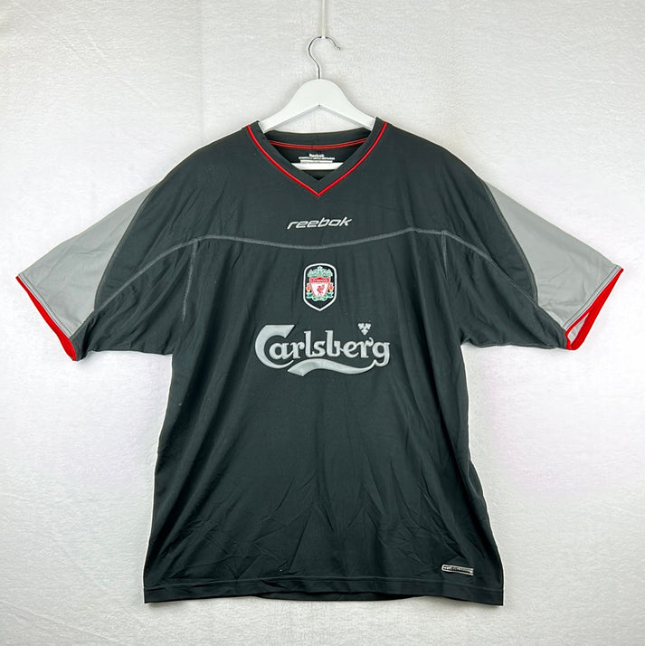
1996 – 2006 – Reebok
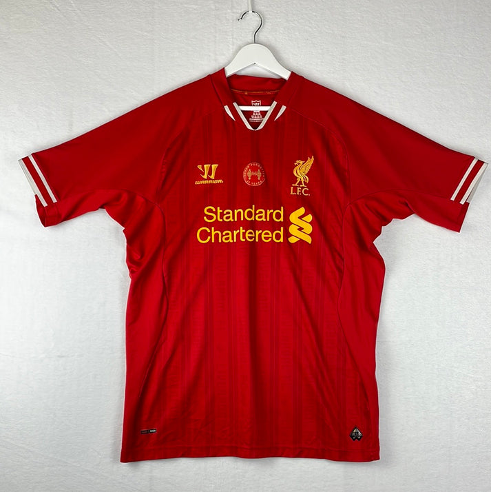
Albeit fairly basic, the most famous Liverpool strip of this decade long era is undoubtedly the 2004/05 home shirt. This is because of that famous night in Istanbul, where the Reds came back from 3-0 down to beat AC Milan on penalties to win the Champions League for a fifth time. However, if you ranked the strips purely on appearance, then the very first home top produced by Reebok, which was worn from 1996 until 1998, would have to be up towards the top. It oozes retro with its white polo collar that is also hooped in red. The Liverpool crest is placed in a white oval.
Two more Reebok classics come in the form of two central crest designs. The first came 1999/00 and stayed until the end of the 2000/01 campaign. It was green with a sash made up of navy and white. For the first year it acted as the away kit, but then it was moved down to the third strip. The second was primarily a rich golden yellow and it was worn in 2001/02 as their third shirt. It had a navy collar and side panels which ran right under its arms.
1985 – 1996 – Adidas
This team-up saw a number of Liverpool classics produced and the success in the early years of the deal definitely helped with that. In 1885/86, donning a collection which saw the same background concept across all of the shirts, the club won the league and FA Cup double. The aforementioned background included tonal stripes with the darker tone having Liver Birds imprinted and the lighter tone having Adidas Originals logos.
In 1889/90, the club secured their 18th league title with a home top that was patterned in a way that saw white being more prominent than usual – this strip in particular is still popular across the fanbase.
From 1991 until 1993, the club wore the same red home jersey and the same green away strip but with a few slight tweaks. In both of the campaigns, the tops had three white blocks running over their left shoulder, but what changed is the Liverpool crest and the placement of the Adidas logo. Adidas placed their logo within the middle white block in the first season, before moving it centrally just under the neckline in the second.
The third kit from 1994 until 1996 is definitely a ‘marmite football shirt’ that divides opinion. It was yellow with a buttoned neckline that had ‘LFC’ stitched into it. One half the jersey was made up of several black Liverpool crests, while they were larger on the left-hand side, almost in a graffiti style, with a little more colour to them.
1973 – 1985 – Umbro
The double diamond brand was the clubs first ever manufacturing deal and it remarkably lasted twelve years. It wasn’t until 1981/82 that Umbro decided to push the boat out and try anything different, with the introduction of red pinstripes to the yellow third kit. It must have gone down well, as from the following campaign until the end of the partnership pinstripes were a feature of all the shirts produced – including the goalkeeper jerseys. Throughout this partnership, the club won seven league titles, four European Cups, an FA Cup and a League Cup.
Liverpool Shirt Sponsor History
The Anfield club has had a relatively small pool of shirt sponsors since their first one back in 1979. Let’s learn more about them…
2010 – present – Standard Charter
Standard Charter has proudly been stamped on the front of Liverpool jerseys for well over a decade and Liverpool has sported the international banking services logo while picking up a fair number of trophies within that time frame.
There have been occasions where the colouring of the feature has changed to best suit the shirt, but in general, since their initial agreement in 2010, the bank’s feature hasn’t been messed with that much at all – you have to give them credit for this, because so often brands come in, chop and change, and end up doing too much.
Though, for one off occasions each season Standard Charter has chosen to promote different initiatives – with the most regular being Seeing is Believing. Seeing is Believing is an initiative that ‘works with Standard Chartered to improve access to affordable eye care in an effort to tackle avoidable blindness’. The club itself has also been known to show to support to the cause.
Another is Futuremakers, this Standard Charter initiative aims to help young people become more equipped with the skills needed to succeed in this new economy.
1992 – 2010 – Carlsberg
It should be no surprise that Liverpool’s deal with Standard Charter has lasted so long, with their previous front of shirt partnership lasting for eighteen years. Although, the Reds’ story with Carlsberg didn’t stop there, with the Danish beer brand still acting as the club’s official beer partner to this day.
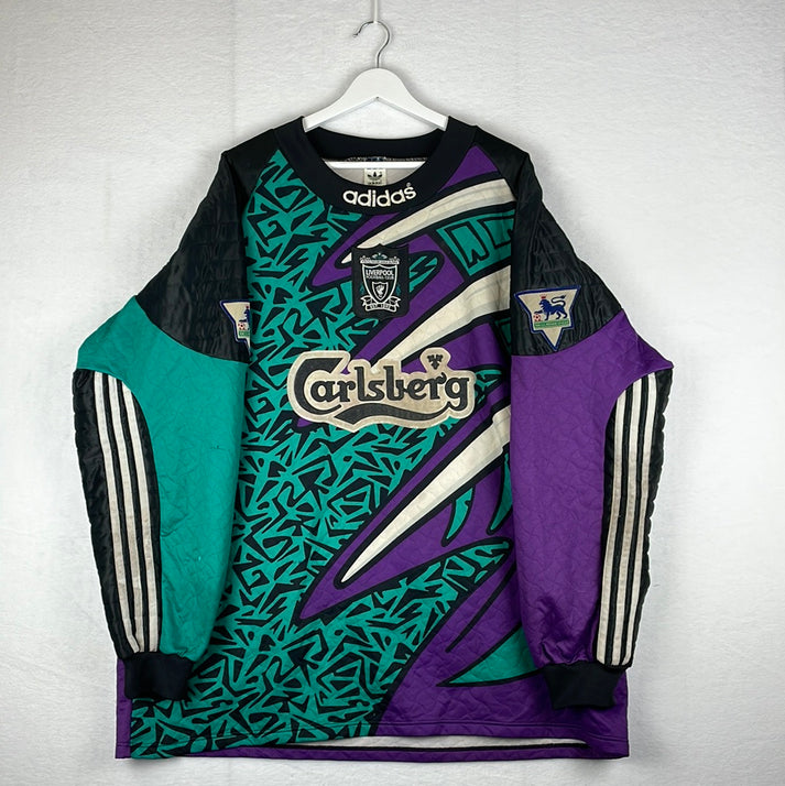
Again, the design of their feature was consistent and it didn’t change once. It was simply ‘Carlsberg’ written out in that well-known text underlined with a swirl.
1988 – 1992 – Candy
Nope, Candy isn’t a sweet brand! It is an Italian company that specialises in domestic appliances.
Their looping, cool text was a little towards the large side, but it was by no means ‘ugly’.
1982 – 1988 – Crown Paints
Crown Paints is a well-established paint manufacturer based in Lancashire. Unlike Carlsberg, Crown Paints did play with their feature a couple of times.
Sometimes the words were beside each other and others the word crown was on top of the word paint. The latter seemingly became the preferred option.
1979 – 1882 – Hitachi
Japanese electronics company, Hitachi, had the honours of being the clubs first ever front of shirt sponsor. Their striking text in block capitals looked crisp across the front of the jerseys.
Conclusion
For a club of their size, it may come as a surprise to some that Liverpool haven’t had that broad of a history when it comes to shirt sponsors and manufacturers. They are a club that seemingly values their relationships with brands. While Adidas may be the holders for the most ‘classical’ range of Liverpool shirts, if Nike continue in the fashion that they are with secondary and third jerseys, then they will have a good few to add to that category themselves in years to come.
Vintage Shirts By Decade
-

1980s Football Shirts
Step back into one of football’s most iconic eras with our collection...
-

1990s Football Shirts & Iconic 90s Kits
Relive the era of bold designs, baggy fits and unforgettable sponsors with...


Popular Teams
-

Vintage Manchester United Shirts
Here's my current stock of Manchester United shirts that are for sale....
-

Vintage Arsenal Shirts
Step into true North London nostalgia with our collection of vintage Arsenal...
-

Vintage Chelsea Shirts
Celebrate the iconic eras of Stamford Bridge with our collection of vintage...
-

Vintage Barcelona Shirts
Immerse yourself in the rich tapestry of FC Barcelona with our stunning...
-

Lionel Messi Shirts
Shop authentic Messi shirts from his time at Barcelona, PSG, Argentina and...
-

Real Madrid Shirts
Step into a realm of royal elegance with our Real Madrid shirt...


Latest Stock
-
Arsenal 1993/1994 Away Shirt - Large - Excellent
Size: 3
Regular price £169.99 GBPRegular priceUnit price per -
England Player Issue 2024 Home Shirt - v Denmark - Bellingham 10
Size: L
Regular price £349.99 GBPRegular priceUnit price per£99.99 GBPSale price £349.99 GBP -
Sheffield Wednesday 1990/91 Away Shirt
Size: L
Regular price £159.99 GBPRegular priceUnit price per -
Arsenal 1993/1994 Away Shirt - 44-46 Size - Excellent
Size: 2XL
Regular price £169.99 GBPRegular priceUnit price per -
Barcelona 2007/08 Home Shirt
Size: S
Regular price £59.99 GBPRegular priceUnit price per -
Arsenal 1993/1994 Away Shirt Small
Size: S
Regular price £149.99 GBPRegular priceUnit price per£139.99 GBPSale price £149.99 GBP -
2014/15 Fortuna Dusseldorf Third Football Shirt (L) Puma
Size: Large
Regular price £45.00 GBPRegular priceUnit price per -
2015/16 Cambridge United Home Football Shirt (XL) Puma
Size: X-Large
Regular price £50.00 GBPRegular priceUnit price per


Match Worn Shirts
-
England Player Issue 2024 Home Shirt - v Denmark - Bellingham 10
Size: L
Regular price £349.99 GBPRegular priceUnit price per£99.99 GBPSale price £349.99 GBP -
England 1992 Player Issue Third Shirt
Size: 3
Regular price £399.99 GBPRegular priceUnit price per -
2024/25 Cambridge United Home Football Shirt (M) Umbro #45 Longelo (Signed | Match Issue)
Size: 0
Regular price £75.00 GBPRegular priceUnit price per -
Lisburn Distillery 2022-23 Match Worn Away - Size L (M Fit) - #19
Size: 0
Regular price £34.99 GBPRegular priceUnit price per


