Manchester City Shirt History
The year 2023 will go down as the most successful year in Manchester City’s history, having matched their Manchester neighbour’s achievement from 1999 of becoming treble winners. When you talk about era’s throughout football, then this is admittedly there’s. Let’s delve into the Cityzens’ kit manufacturer and shirt sponsor history.
Quick links
Kit history download | Kit manufacturers | Shirt sponsors | Conclusion
Manchester City kit manufacturers
- Puma (2019–present)
- Nike (2013–2019)
- Umbro (2009–2013)
- Le Coq Sportif (2007–2009)
- Reebok (2003–2007)
- Le Coq Sportif (1999–2003)
- Kappa (1997–1999)
- Umbro (1967–1997)
Manchester City shirt sponsors
- Etihad Airways (2009–present)
- Thomas Cook (2004–2009)
- First Advice (2002–2004)
- Eidos (1999–2002)
- Brother (1987–1999)
- Philips (1984–1987)
- SAAB (1981–1984)
Manchester City Kit History
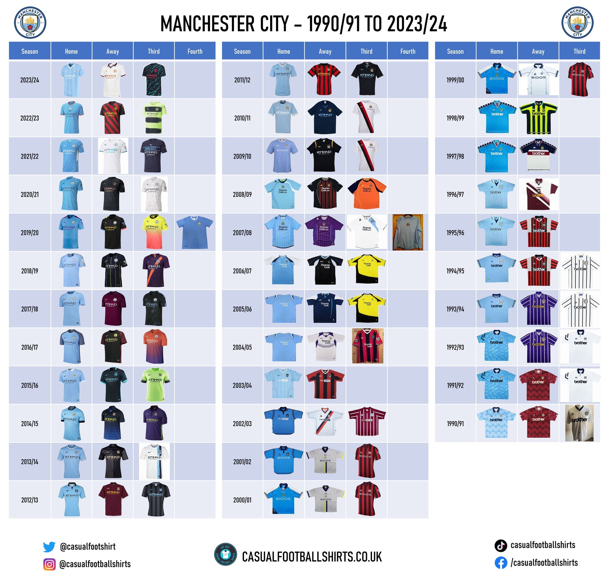
Manchester City Kit Manufacturer History
2019 – present – Puma
As per the Guardian, Manchester City and Puma struck a 10-year-deal back in 2019 and it is worth around £65 million per season. At the time it was penned, it was the second largest kit deal in England, with only Manchester United and Adidas topping it. To say Puma have had their ‘money’s worth’ would be an understatement, given the on the pitch success Pep Guardiola had led City to since then.
Immediate pressure was plunged on to Puma in their first campaign, as the shirts for this season needed to pay recognition to the clubs 125th anniversary. For anniversaries such as this, a lot of manufacturers choose to reinvent the club’s past, or add features that we have seen before, but on this occasion, Puma opted not to go down this route. The German brand produced a home shirt in City’s traditional sky blue, but for the first time in the club’s history purple details were added to it. This came in the form of purple sponsorship logos and text, along with a strip on the shoulders. As described on Manchester City’s website, the shirt had a ‘woven jacquard wave pattern’ running through it as inspiration from Manchester’s industrial heritage.
The away shirt in 2019/20 also paid tribute to Manchester’s history, as the club claims that it honours the city’s ‘Madchester’ years, a period of extraordinary cultural activity in the late 1980s and early 1990s. With yellow zigzags on the left shoulder, it referred to a former Manchester nightclub known as The Haçienda. The strip also had peach and City blue features.
On all of the strips used in the 2019/20 campaign, 125 years was printed under the club crest to recognise the landmark, although, the club also went a step further by releasing a special 125th year anniversary shirt which they wore for one game against Liverpool in the Community Shield. The shirt was a classic, sponsor free strip, with a certificate of incorporation stitched into the inside of the jersey. It had 1884 printed on to the back of its neck, along with the ship from their emblem.
The 2021/22 home shirt goes down as the Sergio Agüero shirt, as it was produced to honour the time he won the club their first ever Premier League title in the dying moments of the game against Queens Park Rangers. The strip is sky blue with white side panels, but it has a subtle repeated graphic of a digital clock embossed. The inside of its crewneck collar has 93:20 woven into it, in reference to Agüero's famous stoppage time winner. The number 10 part of the 20 isn’t filled in and this is in tribute to the Argentinians shirt number.
To round off the Puma section, lets discuss the 2022/23 home jersey, which could arguably now be the most famous shirt in Manchester City history, given the players lifted the Premier League, FA Cup and UEFA Champions League wearing it. The shirt pays tribute to the late 1960’s and club legend Collin Bell, with a centre badge design and maroon and white making up the sleeves cuffs and collar. Furthermore, a crown was placed onto the inside of the strip’s neckline, in reference to ‘Colin the King’. Given their achievements in this kit, it’ll no doubt be sought after for many, many years to come.
2013 – 2019 – Nike
The famous American sportswear brand and the Cityzens enjoyed a six-season partnership with the most interesting jersey produced within that time frame, for me, coming in 2018/19 in the form of their purple and orange third strip.
Mixing purple and orange perhaps isn’t a popular choice, but on this particular occasion, I think it passed the eye test with flying colours (no pun intended). As the shirt was predominately purple, with just one striking orange sash, it wasn’t overdone. Adding further detail to the jersey, and this time personal, was an embossed pattern that was inspired by an aerial representation of East Manchester. The Etihad Stadium was even visible within the sash. An eye-catching monochromatic club crest also piqued interest further.
A close second in the ranking of interesting designs is the 2015/16 away strip. Paying tribute to the clubs famous ‘Blue Moon’ anthem that is played out before every home game, City donned a dark navy-blue jersey with electric blue features. Both of the shirt’s sleeves are said to carry a pattern of the moon at night.
However, despite not being too interesting in terms of design and features, the 2017/18 collection will most probably go down as the most memorable Manchester City football shirts from the Nike x City era. This is because Guardiola’s side remarkably achieved 100 points that campaign – the highest amounts of points achieved in a single season in Premier League history. This squad is now known as ‘The Centurions’. Their maroon away strip from this season was produced in recognition the 1958 FA Cup winning team, while a maroon hoop was also added to the home kit’s socks, but this time as a nod to the 1967/68 title winning side.
2009 – 2013 – Umbro
Spoiler alert, this was Umbro and the Cityzens’ second partnership together and some would say this is when the era of Manchester City ‘dominance’ truly started. Although, interestingly, as per Reuters, this deal ended early and was supposed to be valid for ten seasons.
Supporters will have fond memories of the jerseys worn in the 2010/11 campaign, as not only was this the year the club qualified for the UEFA Champions League for the very first time, but they also finally ended their 35-year trophy drought by defeating Stoke City 1-0 in the FA Cup final. Both the home and away strips from this season were fairly bland, but the third kit was slightly different to what we’re used to seeing. The strip, which was kept on from 2009/10, was white with a black and red sash, although the most interesting part was that the shirt sponsor was moved from the typical technical sponsor slot to being much smaller and placed directly under the club crest. This design is seemingly based off the clubs 1974 – 1977 away outfit.
The 2012/13 home shirt also came with modest differences to a typical City home strip. The sky-blue polo, without buttons, had a black collar and sponsorship features. Something else that was eye catching was that the club crest was altered to become black and white instead of its usual blue and gold.
In the same campaign, the third jersey followed suit in terms of an untraditional emblem. This shirt, which was a black and dark grey striped crewneck design, had an all blue crest to match the strips sponsor features and sleeve cuffs.
2007 – 2009 – Le Coq Sportif
These two seasons of Manchester City strips can officially go down as the ‘centre badge’ era, as four of the seven outfield jerseys produced were based on this concept. Despite it being only just over half the amount, that is fairly high considering it isn’t the ‘traditional’ look for a football kit.
However, in 2007/08, the French brand went in the complete opposite direction by creating a third strip with the City emblem just under the left shoulder line. But, this was by no means their wildest thought, as the following season they handed the Cityzens a luminous orange third jersey with dark navy blue and yellow details.
For the 2007/08 Manchester derby at Old Trafford, both clubs wore stripped back shirts to commemorate the 50th anniversary of the Munich Air disaster. City’s was a plain blue centre badge design with a black ribbon and ‘Manchester Remembers’ on the right shoulder.
2003 – 2007 – Reebok
When it comes to Manchester City home shirts, then I would certainly make a case for the 2003/04 version being right up there with the very best of them. Its classical, V-neck appearance means that retro vibes ooze right through it. The neckline that Reebok gave it was white with sky blue detailing, while the shirts base has subtle stripes made up of different sky-blue tones.
Adding to the classical feeling even further, the 2003/04 away shirt and 2004/05 third jersey were both striped red and black, and you can only assume that Reebok was paying tribute to the late 1960’s and early 1970’s. This is when the club introduced those colours as a secondary kit for the very first time.
Another interesting detail that I noticed while researching this partnership was that Reebok opted against using their traditional logo on the 2006/07 home and away strips and instead opted for ‘RBK’.
1999 – 2003 – Le Coq Sportif
Le Coq Sportif struck their first deal with the Cityzens in back in 1999 and they got off to a flying start by producing a fine home shirt which was worn for consecutive seasons. It seemed to be a silky sky-blue, with navy and white combining to make a V-neck polo collar. The strips arms were half sky blue, half white, while it had a navy-blue triangle patch in the bottom right corner with M.C.F.C stitched in. The French brand opted to make their branding and the club crest central.
Again, the central theme continued on to the away shirt worn in 2000/01 and 2001/02. The jersey had a silky grey base with one yellow stripe and one navy-blue stripe running concurrently up until around the technical sponsor area. In addition to this, one sleeve cuff was yellow, while one was navy-blue.
In 2002/04, Le Coq Sportif took us all the way back to the club’s routes by producing a strip that looked just like Man City’s first ever away jersey. It was a V-neck design, predominately maroon with vertical white stripes.
1997 – 1999 – Kappa
Kappa are the creators of two Manchester City classics that are no doubt sought after across their fanbase.
One is the 1997/98 away strip which has the Italian brands famous logo running down its navy-blue shoulders. The navy-blue continues into the chest area but then has a break of white, which is the shirts base colour, before one maroon strip goes across the shirt sponsor area. The collar is made up of all three of the aforementioned colours, while M.C.F.C was sown into the shirt on the front just under the neckline.
The second is the 1998/99 away top, which combines a lime yellow, a turquoise blue and a dark navy-blue. The shirt’s base colour is the lime yellow, but it has navy-blue stripes which have turquoise blue outlines. The collar and neckline are the same concept to the ones that are on the 1997/98 away shirt, but of course with a different colour pad.
1967 – 1997 – Umbro
Manchester City and Umbro had a remarkable 30-year partnership, but as far as I can verify, it wasn’t until seven years in (1974) that the double diamond logo actually began to appear on the shirts.
It goes without saying that Umbro produced some superb football kits during this period, but I am going to start with the shirt that I find the least appealing out of the whole bunch. It comes in the form of an away strip which was worn from 1988 until 1990 and it had relatively thin maroon and white stripes with a predominately sky-blue collar. For me, it just looks odd.
I am going to mention the next jersey because I just can’t decide whether I love it or hate it. It was used in 1986/87 and 1987/88 as an away top, before transferring to the third strip in 1988/89. It’s talking point is the fact that it was plastered in navy blue and red chequers. Not what we have become accustomed to with City, right? That is probably why I am so undecided on it.
To end the kit manufacturer section on a positive note, I am going to give a shout-out to three shirts from this period that I really like, starting with the 1989 to 1991 home strip. It had a navy-blue polo collar and its sky-blue base had some kind of triangular pattern imprinted. It really brought something different to it.
The design of the shirt mentioned in the previous paragraph must have gone down as a hit, because from 1990 until 1992 the Cityzens donned a maroon jersey with the exact same patterning. It did, however, have two small differences. The collar was not an alternate colour and was instead also maroon and it also had one tiny blue patch and one white patch on both of its sleeve cuffs.
Being honest, I could have talked about many more shirts that was produced during this partnership, so I would highly recommend that you check out these collections, but the final jersey that I am going to describe is the 1995 – 1997 home kit. It’s horizontally striped sky-blue and white polo collar was joined by a base with which had small chequers in different sky-blue tones. Adding to it further was the fact that the club crest was based on stitched in a sky-blue shield which had a navy-blue outline. However, its main and most impressive feature was the fact it had a City crest merged with the word ‘City’ embossed into the stomach and lower chest area.
Manchester City Shirt Sponsor History
The Cityzens shirt sponsor history is actually not that large and each brand that they have partnered with has had simplistic features. Let’s tell you a little bit about them…
2009 – present – Etihad Airways
Manchester City’s partnership with Etihad Airways, the national airline of the United Arab Emirates, has now surpassed a decade and it also includes the naming rights to their stadium.
It hasn’t come without its controversies though, as described below by the Daily Mail:
‘The club’s arrangement with the Abu Dhabi airline formed part of UEFA’s Financial Fair Play probe — launched on the back of leaked documents published in German magazine, Der Spiegel.
Those alleged that, between 2012 and 2016, the majority of Etihad’s £67.5million-a-year sponsorship was funded by the club’s owner, Sheik Mansour.
City strongly denied any wrongdoing and won an appeal with the Court of Arbitration for Sport to overturn a two-year ban from European competition.’
The best word to use to explain how it looks on the Cityzens shirts, for me, would be clean. The text is an elegant font and it doesn’t try to override any features of the jerseys.
2004 – 2009 – Thomas Cook
Thomas Cook is a travel agency founded by a man named…you guessed it – Thomas Cook. In 2019, the organisation sadly collapsed, but it has since been revived by a group of committed former employees.
Until 2007, the surname Cook didn’t start directly underneath the word Thomas, it instead it begun between the o and the m. I think this added a little something to it. Design wise up until that point, it was a good sponsor.
However, from 2007/08 onwards they decided to add .com to the end so it was their website which featured. Although I get the incentive from a brands point of view, personally, I just cannot get on board with this from an appearance perspective.
2002 – 2004 – First Advice
The word advice being in a speech bubble is probably as complexed as the Manchester City shirt sponsor features get, and to be fair, I think it was still a hit.
First Advice was a financial and legal services group and, as per the Guardian, they provided City with a £5 million cash injection. This would have been big for the club back then, but it makes the fees you see touted today even more eye watering.
As an added bonus, the Manchester-based business offered City fans special deals on its financial and legal products. It also supported the club’s community initiatives.
1999 – 2002 – Eidos
Eidos is a video game publisher and it is produced games such as Championship Manager (1992), Tomb Raider (1996), Top Trumps: Doctor Who (2006) and Hitman (2000).
Eidos used a font which was rather thin, so it did have to be slightly enlarged across the shirt.
1987 – 1999 – Brother
Another business which managed to form a partnership with the Cityzens that lasted longer than 10 years was ‘Brother’.
Brother is a Japanese company that specialises in multinational electronics and electrical equipment. The business certainly achieved a decent amount of exposure, as City supporting duo of Noel and Liam Gallagher, exposed the Club and, by association, Brother to a whole new audience, with a famous 1994 NME cover shoot in which the brothers wore City’s home and away shirts.
The font of the feature was all lower case, and I have to say, I really was a fan of this.
1984 -1987 – Philips
When I see Philips, I immediately think of PSV Eindhoven, as the pair had an astonishing 33-year relationship together.
Philips is a Dutch manufacturer of consumer electronics, electronic components, medical imaging equipment, household appliances, lighting equipment, and computer and telecommunications equipment.
On their website, the brand pledges that their purpose is ‘to improve people’s health and well-being through meaningful innovation’.
The feature doesn’t ruin the design and it is relatively smart, albeit not my favourite font compared to some of the others within this list.
1981 – 1984 – SAAB
The honour of becoming City’s first ever shirt sponsor was SAAB’s, a car manufacturing firm which had originated from Sweden. Unfortunately, the automobile business defunct in 2011, but the name now lives on within the innovative defence and security sector.
With SAAB, City supporters had a sound introduction to jerseys with technical sponsors. It was short and sweet, with no big, daft logo – it gets a thumbs up from me.
Conclusion
If you’re a Manchester City supporter reading this article, then go and check out Umbro’s first range of City shirts – many are undeniably fantastic. I am really disappointed that they didn’t do more with their partnership the second time round to bring some of those classics back to life.
Finally, in terms of shirt sponsorships, City seem to find long-term partners and the settle on them. The club hasn’t yet fallen victim to a big, ugly logo taking over the shirt and long may that continue.
Vintage Shirts By Decade
-

1980s Football Shirts
Step back into one of football’s most iconic eras with our collection...
-

1990s Football Shirts & Iconic 90s Kits
Relive the era of bold designs, baggy fits and unforgettable sponsors with...


Popular Teams
-

Vintage Manchester United Shirts
Here's my current stock of Manchester United shirts that are for sale....
-

Vintage Arsenal Shirts
Step into true North London nostalgia with our collection of vintage Arsenal...
-

Vintage Chelsea Shirts
Celebrate the iconic eras of Stamford Bridge with our collection of vintage...
-

Vintage Barcelona Shirts
Immerse yourself in the rich tapestry of FC Barcelona with our stunning...
-

Lionel Messi Shirts
Shop authentic Messi shirts from his time at Barcelona, PSG, Argentina and...
-

Real Madrid Shirts
Step into a realm of royal elegance with our Real Madrid shirt...


Latest Stock
-
2014/15 Fortuna Dusseldorf Third Football Shirt (L) Puma
Size: Large
Regular price £45.00 GBPRegular priceUnit price per -
2015/16 Cambridge United Home Football Shirt (XL) Puma
Size: X-Large
Regular price £50.00 GBPRegular priceUnit price per -
2019/20 Cambridge United Home Football Shirt (S) Hummel
Size: Small
Regular price £50.00 GBPRegular priceUnit price per -
1997/98 Feyenoord Home Football Shirt (M) Adidas
Size: Medium
Regular price £120.00 GBPRegular priceUnit price per -
2015/16 Cambridge United Goal Keeper Football Shirt (S) Puma #35 Norris
Size: Small
Regular price £60.00 GBPRegular priceUnit price per -
2017/18 Cambridge United Third Football Shirt (L) Puma #23 Corr
Size: Large
Regular price £60.00 GBPRegular priceUnit price per -
2023/24 Cambridge United Home Football Shirt (XL) Umbro
Size: X-Large
Regular price £45.00 GBPRegular priceUnit price per -
2022/23 Cambridge United Home Football Shirt (2XL) Hummel #2 Williams
Size: 2XL
Regular price £55.00 GBPRegular priceUnit price per


Match Worn Shirts
-
2024/25 Cambridge United Home Football Shirt (M) Umbro #45 Longelo (Signed | Match Issue)
Size: Medium
Regular price £75.00 GBPRegular priceUnit price per -
Lisburn Distillery 2022-23 Match Worn Away - Size L (M Fit) - #19
Size: 0
Regular price £34.99 GBPRegular priceUnit price per -
Lisburn Distillery 2024-25 Match Worn Away - Size L (M Fit) - #11
Size: 0
Regular price £34.99 GBPRegular priceUnit price per -
2011/12 RC Lens Home Football Shirt (L) Adidas (Player Issue)
Size: Large
Regular price £55.00 GBPRegular priceUnit price per


