MK Dons Shirt History
MK Dons’ birth was just 19 years ago, following the controversial relocation of Wimbledon FC – not to be confused with AFC Wimbledon. As you may have guessed, this makes them the country’s newest football league club. Nevertheless, we have put together a thorough run down of their shirt history.
MK Dons Shirt History
Downloadable guide
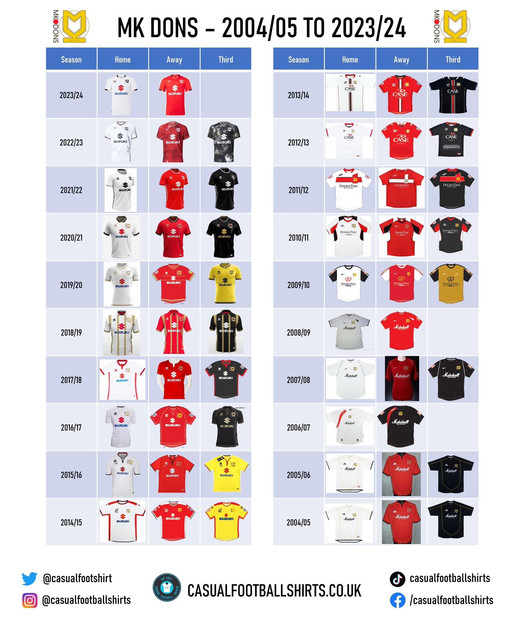
MK Dons Kit Manufacturer History
2022 – present – Castore
Establishing in 2015, Castore could be described as a relatively ‘new name on the block’ in terms of sportswear manufacturers. However, they have wasted no time in attempting to get noticed having also struck deals with Aston Villa, Rangers and Newcastle to name a few, as well as venturing into other sports such as cricket and Formula 1 with England and McLaren, respectively.
Despite their bold market moves, their time with the Dons up until now could not be described as ‘smooth sailing’. Supply issues, which sometimes even effected the first team, reportedly mudded the pairs relationship in 2022/23, and that isn’t the only thing followers of the Milton Keynes club took issue with.
MK Dons has traditionally always had a clean white home shirt, but Castore decided to take a risk by adding a hint of grey, in the shape of a subtle cloud like pattern. Research suggests that this went ‘down like a lead balloon’ with sections of the fanbase. To make matters worse, and to make sure the 2022/23 campaign was one to forget, the club was also relegated to League Two.
After a murky first season, the kit supplier had promised to take things back to basics for 2023/24, and with their home shirt this is exactly what they have done. Although, that isn’t to say Castore haven’t taken a risk at all…
The Manchester headquartered manufacturer has decided to introduce a blue third kit for the first time in the club’s history – the colour Wimbledon FC wore prior to their move to the Milton Keynes.
2015 – 2022 – Erreà
Interestingly, Erreà is known for being the first Italian sportswear company to be accredited with a certification which assures that their garment textiles are free from harmful chemicals.
Their partnership with the Dons lasted seven seasons and for the most part they got it right. A personal favourite is the 2019/20 home shirt, which is tidily white with touches of gold. The 2020/21 home strip backed this up well, which again was white and gold, but this time it also had black applications added in.
Errerà did however produce three eye sore strips in 2018/19. All three kits followed the same concept of being a polo shirt with four fairly large horizontal golden stripes – you could argue it came across as ‘too much’, despite the base colour.
If you’re a fan of a special edition strip then you’ll want to check out the shirt MK Dons wore to take on Bolton at home in 2016/17. An all gold top with ‘MK50’ replacing the shirt sponsor was brought out to mark the cities 50th birthday, and it was a carnival like atmosphere with the club’s chairman dishing out free tickets for the game to MK residents. Spectators witnessed a 1-1 draw.
2012 – 2015 – Vandanel/Sondico
Vandanel is the name that Sondico was recognised by up until November 2012. For three seasons the manufacturer and the Dons enjoyed a positive relationship, with the clubs then executive director, Andrew Cullen, reiterating the partnership ended on “good terms” in a closing statement.
Sondico had the honours of producing the kits to mark the football clubs 10th anniversary in 2013/14 and many would say that they did the occasion justice. Three identically patterned strips were brought out, with only the colours changing each time. Its main feature was a bold horizontal line down the middle of the shirt with two thin lines either side.
However, the aforementioned strip isn’t the only historic MK Dons outfit. The 2014/15 collection has gone down as a fan favourite, given it is the campaign that they won promotion to the Championship for the first (and only!) time.
Making it a hattrick, the 2012/13 red away shirt is also recognisable as it was the kit that Dele Alli, arguably the most high-profile player in the club’s short history, wore to make his debut against Cambridge City in the FA Cup first round. He was just 16.
2010 – 2012 – ISC
ISC is an Australian brand that is more popular across both codes of rugby, respectively. In fact, according to Football Kit Archive, MK Dons are the only English team that the manufacturer has worked with.
Some would say that the 2011/12 collection that was produced for the Dons did have a very ‘rugby like’ feel to them. Not because of the materials, but because of the appearance with the ISC logo featuring more towards the left shoulder than in the typical manufacturer position.
A cool little fact about ISC: They had an exclusive contract with Marvel to design rugby jerseys for Australian Rugby League teams to wear displaying some Marvel superheroes. The latest series of this took place in 2017.
2007 – 2010 – Nike
Nike and MK Dons had a three-season relationship and while relatively uninteresting in appearance, the 2007/08 strips are probably the pick of the lot. They have an iconic feel to them given that you could stake a claim for it being the clubs most successful season in its history, having won the League Two title and the Football League Trophy.
The third shirt which was worn in 2009/10 has a really smart feel to it, giving off Manchester United 2001/02 vibes. Its base colour was silky gold with black arms.
2006 – 2007 – Surridge
Surridge is another brand that produced shirts for the Dons with their logo in an interesting top left shoulder position.
They are also the only manufacturer to brave placing the club crest in the centre of the shirt and to be fair, it is probably a good job that they did, because other than that there isn’t a great lot to write home about.
2004 – 2007 – A Line
A Line had the privilege of being the company behind the first ever MK Dons strip. The Don’s wore the same shirt for two consecutive seasons, so if you have an A Line branded MK Dons kit then you’re probably sitting on gold dust.
Combining the white and gold for the home shirt again worked well, as did the black and gold for the third kit. The away top followed suit with red and gold, and surprisingly it did look fairly good.
MK Dons Sponsor History
MK Dons have had four shirt sponsors in their history, and in all honesty, for the most part, they have all matched up to the shirt fairly decently.
2014 – present – Suzuki
Suzuki is a well-known Japanese automobile corporation and it has served the Dons for an impressive nine seasons, with the tenth being 2023/24.
During their most recent announcement of a deal extension between the pair, MK Dons stressed that the partnership continues to extend ‘way beyond the football pitch’ – Suzuki are believed to be generous in their support of the Milton Keynes Sport and Education Trust. Nobuo Suyama, Managing Director of Suzuki GB PLC, commented that it is a “mutually beneficial partnership.”
But how does the logo look on the shirt? Other than when they insist on making the Suzuki S its traditional red on the home kit, when it clearly doesn’t match, it actually looks good. There have been occasions where they have altered this.
2012 – 2014 – Case Security
Case Security’s website describes them as an ‘ethical security integrator’. Following the end of their shirt sponsorship agreement, Case Security penned a three-year deal to continue sponsoring Stadium MK’s tunnel, dugouts, 3-D mats and ball boys.
Benefitting from many key features on the home shirt being red while the partnership was ongoing, and despite the criticism’s regarding Suzuki’s red S, the security firms red logo actually complimented the kit quite nicely.
2008 – 2012 – Doubletree by Hilton
Doubletree by Hilton is a hotel chain that actually has a plot attached to Stadium MK. Some of their rooms even have a pitch view.
For one season they had their logo with the text on the shirt, but for the other two they simply had their name in writing. Although neither looked bad, the writing probably looked the best.
2004 – 2008 – Marshall Amplifications
Marshall is a company based in Britain that produces music amplifiers, earphones, speaker cabinets, drums and bongos. They even own their own record label – Marshall Records.
A statement on the Dons’ website states that Marshall’s financial support has been vital for the club’s women’s team.
Their feature was joined up italic writing which is a little difficult to read on a football shirt, but it by no means faulted the tops appearance in any way.
Conclusion
Overall, there hasn’t really been any ‘monstrosity’ shirts produced for MK Dons. The club has also seemingly had many meaningful relationships with their corporate sponsors – which somewhat creates more of a meaning to their feature on the top.
Vintage Shirts By Decade
-

1980s Football Shirts
Step back into one of football’s most iconic eras with our collection...
-

1990s Football Shirts & Iconic 90s Kits
Relive the era of bold designs, baggy fits and unforgettable sponsors with...


Popular Teams
-

Vintage Manchester United Shirts
Here's my current stock of Manchester United shirts that are for sale....
-

Vintage Arsenal Shirts
Step into true North London nostalgia with our collection of vintage Arsenal...
-

Vintage Chelsea Shirts
Celebrate the iconic eras of Stamford Bridge with our collection of vintage...
-

Vintage Barcelona Shirts
Immerse yourself in the rich tapestry of FC Barcelona with our stunning...
-

Lionel Messi Shirts
Shop authentic Messi shirts from his time at Barcelona, PSG, Argentina and...
-

Real Madrid Shirts
Step into a realm of royal elegance with our Real Madrid shirt...


Latest Stock
-
2013/14 Canada Away Football Shirt (S) Umbro
Size: Small
Regular price £60.00 GBPRegular priceUnit price per -
2016/17 France Away Football Shirt (L) Nike #16 Bouhaddi (Womens)
Size: Large
Regular price £35.00 GBPRegular priceUnit price per -
2012/13 Germany Home Football Shirt (XL) Adidas
Size: X-Large
Regular price £50.00 GBPRegular priceUnit price per -
1994/95 Northern Ireland Home Football Shirt (XL) Umbro (Prototype)
Size: X-Large
Regular price £120.00 GBPRegular priceUnit price per -
2012/13 Germany Home Football Shirt (S) Adidas #8 Ozil
Size: Small
Regular price £75.00 GBPRegular priceUnit price per -
1992/94 Uruguay Home Football Shirt (XL) Ennerre
Size: X-Large
Regular price £150.00 GBPRegular priceUnit price per -
2012/13 Togo Home Football Shirt (XL) Puma
Size: X-Large
Regular price £65.00 GBPRegular priceUnit price per -
2002/03 Croatia Home Football Shirt (L) Nike #9 Suker
Size: Large
Regular price £110.00 GBPRegular priceUnit price per


Match Worn Shirts
-
Lisburn Distillery 2022-23 Match Worn Away - Size L (M Fit) - #19
Size: 0
Regular price £34.99 GBPRegular priceUnit price per -
Lisburn Distillery 2024-25 Match Worn Away - Size L (M Fit) - #11
Size: 0
Regular price £34.99 GBPRegular priceUnit price per -
2011/12 RC Lens Home Football Shirt (L) Adidas (Player Issue)
Size: Large
Regular price £55.00 GBPRegular priceUnit price per -
1996/98 Germany Home Football Shirt (M) Adidas (BNWTs) Offical Re-Issue
Size: Medium
Regular price £75.00 GBPRegular priceUnit price per


