Newcastle United Shirt History
Newcastle United’s nickname of ‘the Magpies’ stems from their famous black and white stripes and there has been a couple of interesting variants of them over the years. Let’s check out the Geordie clubs’ kit manufacturer and shirt sponsor history…
Quick links
Shirt history download | Kit manufacturers | Shirt sponsors
Newcastle United shirt sponsors
- Sela (2023–present)
- Fun88 (2017–2023)
- Wonga (2013–2017)
- Virgin Money / Northern Rock (2003–2013)
- NTL (2000–2003)
- Newcastle Breweries (1991–2000)
- McEwan’s Lager (1991–1995)
- Greenalls (1985–1991)
- Newcastle Breweries (1980–1985)
Newcastle United kit manufacturers
- Castore (2020–present)
- Puma (2010–2021)
- Adidas (1995–2010)
- Asics (1993–1995)
- Umbro (1980–1993)
- Bukta (1976–1980)
- 1976 and before
Newcastle United - Shirt History Download

Newcastle United’s Kit Manufacturer History
2020 – present – Castore
This is a deal that has been disastrous for Castore in terms of reputation, with the North East club already announcing an agreement is in place with Adidas from 2024/25 onwards. Reports suggest that Newcastle’s partnership with Castore was supposed to last until 2025/26, but an early exit from the Geordie club comes following complaints from several supporters over merchandise quality and delivery delays.
More eyebrows were raised in 2022/23, when a third kit which featured green was released following the club’s controversial Saudi takeover. Any criticism received certainly didn’t faze either party this time though, as the 2023/24 away kit is fully green with a tonal pattern imprinted.
Although, being short sighted and looking at things purely from a design perspective, the Manchester brand hasn’t done too bad of a job and initially they did kickstart the partnership with a positive move. The 2020/21 home shirt was brought together with a buttoned neckline feature known as the ‘grandad collar’, something which has been historically popular across the Magpies fanbase since it was included on the 1995 – 1997 Adidas home strip.
To mark the clubs 130th anniversary in 2022, Castore released a limited-edition shirt that had vertical grey tonal stripes and no sponsor. Feathers and a stripped back club crest were embossed.
2010 – 2021 – Puma
Adding to the embarrassment for Castore is the fact that Newcastle’s previous manufacturing partnership with Puma lasted for just over a decade. Albeit the German brand did push their luck a couple of times with vibrant away and third jerseys – the 2019/20 orange third shirt and 2020/21 yellow away kit are perfect examples of this. A favourable away strip is the 2018/19 edition, as it is a modern remake of their admirable 1995/96 Adidas away top, which hooped in maroon and navy stripes.
Several nice home shirts came out of this period, with some of them done rather differently. Falling into the different category is the 2015/16 version. The black and white stripes are broken up by blue lines running through them starting just under the sponsorship feature. The sleeve cuffs and neckline are the same blue. This strip is dampened by the fact the Magpies got relegated to the Championship this campaign. However, this does mean that the 2016/17 home top, which has a polo collar and gold features, signifies huge relief given their instant Premier League return.
Another home shirt that deserves a mention is the one worn in 2019/20. Although it includes stripes, it isn’t traditionally striped. Its base has two white stripes and one black one, while the sides and sleeves are also black. The crest is placed centrally.
In 2013/14 and 2014/15, Puma released special jerseys exclusively available to registered Newcastle members. If you have either of these, then they are certainly ones to cherish.
1995 – 2010 – Adidas
Of course, the finances must have been good too, but purely from a design perspective, it is easy to see why Newcastle partnered with Adidas for so long. However, before we get into those classics, one questionable jersey from this range is the 2009/10 away strip. It is a centre crest design with rather obvious, large tonal yellow stripes. Though, the shirt is perhaps saved by the fact the Magpies earned another instant Premier League return in following relegation in 2008/09.
Like Puma, Adidas also played around with adding touches of blue to a home strip and it came off really nicely with the version worn from 1999 until 2001. Blue trims ran up the front of its polo like collar, around its sleeve cuffs and around the bottom trim. The white away strip with teal and black features that was worn alongside it in 1999/00 was a similar concept.
A rather different away shirt came in 1997/98, it was navy blue with an orange and green conjoined stripe running through the Adidas logo on its left. Orange and green also made up its crewneck neckline. The shirt sponsor for this campaign was moved to the left of the stomach area, so that you could see clearly the embossed seahorse. The home shirt worn in this campaign, and also for the 1998/99 season, was a cool traditionally striped central crest concept.
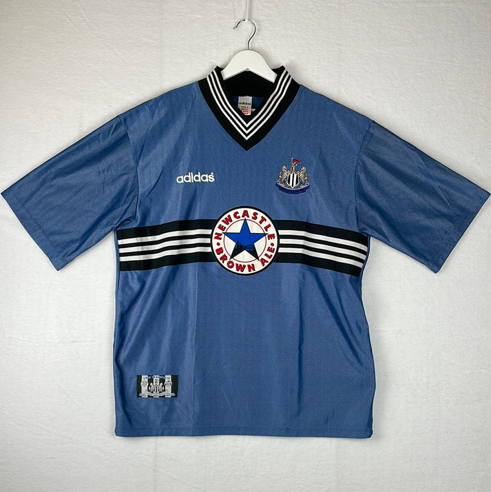
Another away strip filed in the ‘classic’ category is the 1996/97 edition. It was blue with subtle thin tonal stripes running through it. Across the sponsorship area was a black block with three vertical white stripes. Its thick V-neck collar followed similar patterning.
1993 – 1995 – Asics
The same shirts were worn over two years during the Magpies’ spell with Asics. Each of them had polo collars, but the away shirt was probably the most interesting of the lot, with its blue tie-dye like effect colouring. Although, the third kit did have its own talking points, as it was green with thin horizontal blue stripes.
1980 – 1993 – Umbro
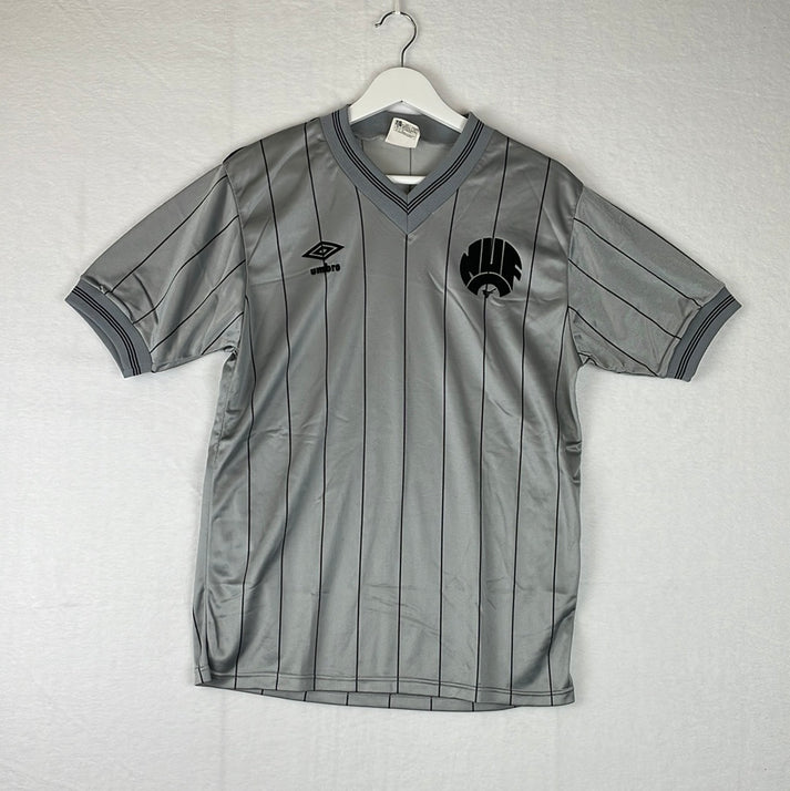
Umbro had a thirteen-year relationship with Geordie club that started out in 1980. There are a few beloved jerseys from this range and most of them came within the period of 1983 and 1987, albeit this wasn’t necessarily because of the shirt design. A large factor of this is because of the club crest used throughout these years. It was a curved design that had NUF above an upturned C. A small magpie was placed under the C. There was a particularly smart silky silver away strip that had black pinstripes, which featured this emblem, used between 1983 – 1985.
Green and yellow became the theme for other away jerseys, with the opted for design used from 1988 onwards being the most eye catching. The base of the strip was yellow, but it was almost like it was broken up into subtle squares that were halved by green lines shaping out triangles. In fairness, the home shirt used within this period didn’t catch the eye much less, as it was too victim of an interesting ‘out there’ concept. Half of this jersey had thin stripes, while the other half had thick stripes. The sleeves also didn’t match each other either. It is said to be a rare collector’s item.
1976 – 1980 – Bukta
Newcastle wore the same Bukta home and away strips for all four seasons and a third was even introduced from 1978. All three of them followed the same concept of being polo collared central crest designs with Bukta logos running consecutively all the way down the sleeves.
1976 and before
From 1976 onwards, the Magpies’ history becomes a little unclear. Football Kit Archive suggests that in some campaigns, the club had manufactured home shirts but in-house alternate strips. The most prominent brand used was Bukta, who was their first ever supplier, but they did also have a short spell with Admiral. As expected for this period, the jerseys were basic and didn’t really feature any of the manufacturers branding, however, despite being fully in-house for the 1975/76 season, Umbro did jump in and slap their logo on a special edition shirt used for the League Cup final against Manchester City. The Cityzens won 2-1.
Newcastle United Shirt Sponsor History
2023 – present – Sela
The Sela and Newcastle deal is a controversial one that has picked up plenty of media coverage. Sela, which is an events company, is majority-owned by Saudi Arabia’s Public Investment Fund, which also holds an 80% stake in the club.
The feature includes the brands simplistic logo to the left of the word Sela, so despite the muddy background behind it, it doesn’t look too bad.
2017 – 2023 – Fun88
Asia-focused gambling brand, Fun88, were dropped as the North Easts clubs front of shirt sponsor, but the pair continue to have a relationship as Fun88 are now Newcastle’s official Asian betting partner. The aim of this new deal is to boost the club’s commercial growth in the continent. Their feature included ‘Fun88’ with Chinese text above it. It wasn’t the prettiest, but there’s worst to come...
2013 – 2017 – Wonga
Wonga, founded in 2006, is a British payday loan firm. As per Chronicle Live, ‘Wonga’s involvement with Newcastle was condemned by MPs and many fans’. This is because ‘the firm was accused of using football to target the poorest fans into taking out high interest short-term loans’. At one-point, former striker Papiss Cisse refused to wear a shirt with Wonga branding due to his religious beliefs.
For three of the four seasons, the business splattered a big ugly blue speech bubble on the jerseys with wonga.com written within it. In their final year, it was a little more bearable as only the W was inside of a speech bubble.
2003 – 2013 – Virgin Money / Northern Rock
In January 2012, banking firm Northern Rock were bought out by Virgin Money and subsequently the branding on the Newcastle jerseys changed. With the Northern Rock feature having no large logo, it was quite a shock when the big red virgin one appeared.
In the early years, Northern Rock played with blue and gold font colours to try and strike a balance with the black and white stripes, but in the end they opted for a stick-on approach with a black background and white text.
2000 – 2003 – NTL
Coincidentally, another one of Newcastle’s former sponsors, NTL, has also been taken over by the Virgin group. They are now known as Virgin Media.
You wouldn’t think NTL’s purple and green logo would look good on Newcastle’s black and white home shirt, but it surprisingly wasn’t horrendous. White versions appeared on the alternate strips.
1991 – 2000 – Newcastle Breweries
Newcastle Breweries sponsored all of the kits from 1994, but just the home shirt up until then. Also up until 1994, just the blue star from their logo featured on the shirts, with the five points of the star representing the five founding breweries of Newcastle. From 1994, they used the branding of the famous beverage Newcastle Brown Ale.
The vintage feel of the Newcastle Brown Ale option makes it the preference, but in truth this sponsorship is a positive on a whole due to the ‘Geordie’ feel to it.
During this partnership, the Magpies decided to switch to holiday village 'CenterParcs' for just one game when they played Monaco in the 1996/97 UEFA Cup quarter final. This was to avoid controversy as alcohol sponsors are forbidden in France.
1991 – 1995 – McEwan’s Lager
Another alcohol brand in McEwan’s Lager sponsored the clubs away and third shirt for four seasons. The branding was a simple text feature with no flashy logo. It looked good.
1985 – 1991 – Greenalls
Yet another alcoholic beverage supplier in Greenalls partnered with the club from 1985 until 1991. There were various versions of their branding throughout this period. One was just ‘Greenalls’ in black text, another was ‘Greenalls Beers’ in green text with a white background and another was just ‘Greenalls’ in white text on a black background. The first option and the latter option are the plays for me.
1980 – 1985 – Newcastle Breweries
The aforementioned Newcastle Breweries were the clubs first ever shirt sponsorship partner and for a couple of years during this initial spell they included a silver circle around the blue star on the home strip. It looked much better without.
Conclusion
Newcastle is a club that has stayed fairly loyal to shirt manufacturing partners over the years, so there is definitely egg on the face of those at Castore for this early exit. Although, given the classics we have seen previously, there is understandably huge anticipation for this upcoming new Adidas era. Sadly, the club hasn’t quite got it right in the last few decades on the shirt sponsor front, with a number of controversies, something they seemingly actively avoided in previous years.
Vintage Shirts By Decade
-

1980s Football Shirts
Step back into one of football’s most iconic eras with our collection...
-

1990s Football Shirts & Iconic 90s Kits
Relive the era of bold designs, baggy fits and unforgettable sponsors with...


Popular Teams
-

Vintage Manchester United Shirts
Here's my current stock of Manchester United shirts that are for sale....
-

Vintage Arsenal Shirts
Step into true North London nostalgia with our collection of vintage Arsenal...
-

Vintage Chelsea Shirts
Celebrate the iconic eras of Stamford Bridge with our collection of vintage...
-

Vintage Barcelona Shirts
Immerse yourself in the rich tapestry of FC Barcelona with our stunning...
-

Lionel Messi Shirts
Shop authentic Messi shirts from his time at Barcelona, PSG, Argentina and...
-

Real Madrid Shirts
Step into a realm of royal elegance with our Real Madrid shirt...


Latest Stock
-
2013/14 Canada Away Football Shirt (S) Umbro
Size: Small
Regular price £60.00 GBPRegular priceUnit price per -
2016/17 France Away Football Shirt (L) Nike #16 Bouhaddi (Womens)
Size: Large
Regular price £35.00 GBPRegular priceUnit price per -
2012/13 Germany Home Football Shirt (XL) Adidas
Size: X-Large
Regular price £50.00 GBPRegular priceUnit price per -
1994/95 Northern Ireland Home Football Shirt (XL) Umbro (Prototype)
Size: X-Large
Regular price £120.00 GBPRegular priceUnit price per -
2012/13 Germany Home Football Shirt (S) Adidas #8 Ozil
Size: Small
Regular price £75.00 GBPRegular priceUnit price per -
2012/13 Togo Home Football Shirt (XL) Puma
Size: X-Large
Regular price £65.00 GBPRegular priceUnit price per -
2002/03 Croatia Home Football Shirt (L) Nike #9 Suker
Size: Large
Regular price £110.00 GBPRegular priceUnit price per -
2002/04 Argentina Away Football Shirt (M) Adidas #9 Batistuta
Size: Medium
Regular price £120.00 GBPRegular priceUnit price per


Match Worn Shirts
-
Lisburn Distillery 2022-23 Match Worn Away - Size L (M Fit) - #19
Size: 0
Regular price £34.99 GBPRegular priceUnit price per -
Lisburn Distillery 2024-25 Match Worn Away - Size L (M Fit) - #11
Size: 0
Regular price £34.99 GBPRegular priceUnit price per -
2011/12 RC Lens Home Football Shirt (L) Adidas (Player Issue)
Size: Large
Regular price £55.00 GBPRegular priceUnit price per -
1996/98 Germany Home Football Shirt (M) Adidas (BNWTs) Offical Re-Issue
Size: 0
Regular price £75.00 GBPRegular priceUnit price per


