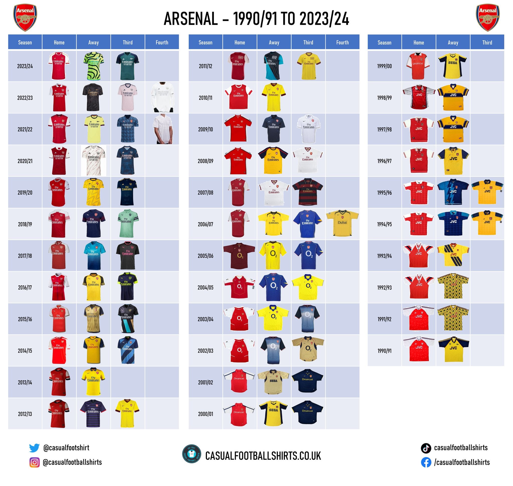
Arsenal Shirt History - Every Manufacturer and Sponsor
Let's take a look at their kit manufacturer and sponsor history.
- No Sponsor (Pre-1981)
- JVC (1981–1999)
- SEGA / Dreamcast (1999–2002)
- O2 (2002–2006)
- Fly Emirates (2006–2023)
- Emirates: Fly Better (2020–Present)
Arsenal Kit Manufacturer History
- 2019 – present – Adidas
- 2014 – 2019 – Puma
- 1994 – 2014 – Nike
- 1986 – 1994 – Adidas
- 1977 – 1986 – Umbro
- 1977 and before
Arsenal Kit History Checklist
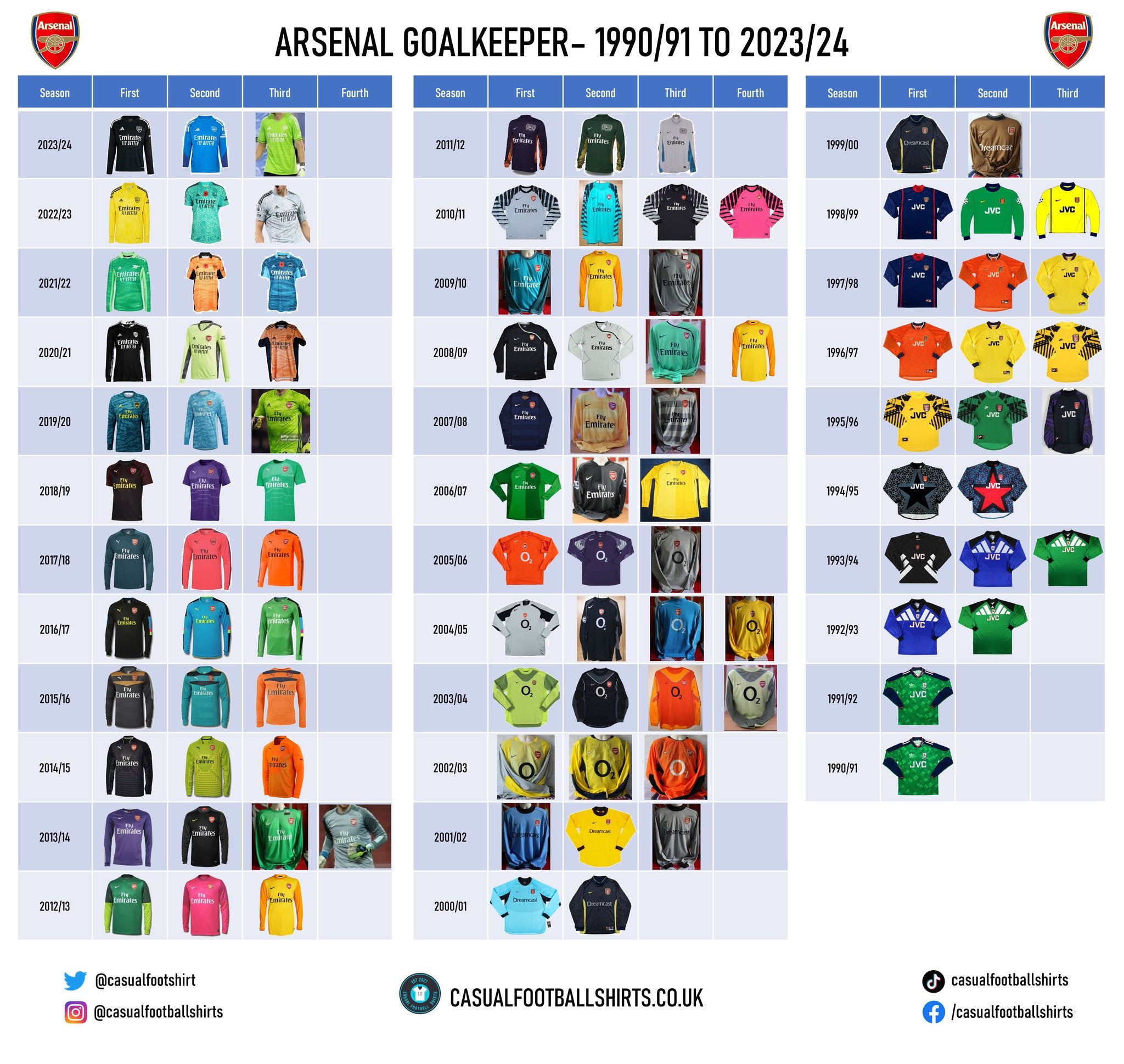
Arsenal Goalkeeper Shirt History
As requested on the Arsenal shirt collectors Facebook group, here are all the Arsenal goal keeper shirts from 1990 onwards!
Arsenal Shirt Sponsor History
For a club of their size, Arsenal have had a small pool of shirt sponsors in their time. Let’s get right into it…
Here is the quick guide from our YouTube channel - https://youtube.com/shorts/pWquTWVg30c?feature=share
📺 No Sponsor (Pre-1981)
-
Shirts featured only the badge — rare and collector-preferred
-
Seen on the 1971 Double winners, 1979 FA Cup winners
This was common across all football shirts, with sponsors not coming in until the 1980s for most teams.
🖥️ JVC (1981–1999)
-
Duration: 18 years — Arsenal’s longest-running sponsor
-
Design Integration:
-
Prominent red block lettering
-
Worked well with Adidas and Nike designs
-

-
Memorable Moments:
-
1989 League Title (Anfield '89)
-
1993 Cup Double
-
1998 Premier League & FA Cup Double
-
JVC became synonymous with Arsenal’s golden years under George Graham and early Wenger.
-
The JVC-sponsored shirts were the classic look for Arsenal as they took on Manchester United in a rivalry that spanned the 1990s. My personal favourite from this era was the Arsenal 95/96 away shirt ( even as a Manchester United fan!). The lightning bolt was an iconic look and has been redone on more modern shirts by Adidas.

💻 SEGA / Dreamcast (1999–2002)
-
Split Sponsorship:
-
Home kits: Dreamcast
-
Away kits: SEGA logo
-
-
Era: Early Arsène Wenger years with Henry, Vieira, and Pires
-
Fan Rating: Very high nostalgia value
🎮 Retro Value:
Dreamcast kits are now some of the most sought-after 2000s kits — expect to pay £80+ for good condition.
Here is my favourite shirt from this era -

Did you know - The same shirt was used the year after with the 02 sponsor but never commerically sold. In all my years of selling football shirts I've never had one in stock and have only ever seen one avaibale for sale that was genuine - it sold for over £2,000 on eBay in 2023.
🛫 O2 (2002–2006)
-
Design: Large blue “O2” circle centered on chest
-
Historic Moment:
-
2003–04 Invincibles season — home and away shirts are iconic
-
-
Last Season: 2005–06 maroon kit for Highbury farewell
✈️ Fly Emirates (2006–2023)
-
Duration: 17 years
-
Kits: Spanned Nike, Puma, and Adidas eras
-
Notable Designs:
-
2006–08: Redcurrant trim
-
2011–12 Away: Navy & turquoise
-
2019–23: Adidas throwback revivals
-
💼 Branding Influence:
Emirates helped globalize Arsenal's brand — but many fans felt the sponsor overstayed its welcome.
🪙 Emirates: Fly Better (2020–Present)
-
Slight rebrand of the original Emirates logo
-
Appears cleaner, with simpler design language
-
Seen on 2023/24 kits and expected to continue
Arsenal Kit Manufacturer History
2019 – present – Adidas
Arsenal, founded in 1886, signed a deal with Adidas in 2019, and the German sports apparel company has not disappointed with most of the Gunners' kits produced since that year, which have contained a lot of character. After reviewing the collection, one would assume that not many, if any, fans have complaints about the fact that the pair extended their partnership until at least 2030, as announced in September 2022.

Adidas had a steady first year with the North London club, but then really began to flex their creative muscle in 2020/21 with a rather interesting away and third shirt. The away strip was white, with unique, striking dark red lines that appeared as cracks on the top, referring to the marble halls at their old stadium, Highbury.
Fun fact – goalkeeper Bernd Leno had to wear this shirt in a home game against Wolverhampton Wanderers in November 2020.
Moving on to 2021/22, the promo for their jazzy third strip this campaign was named ‘A Bolt from the Blue’, paying tribute to their memorable 1994/95 and 1995/96 away jerseys. The lightening bolt pattern on the crewneck top is made up of different tones of blue with scarlet borders. Another nice little addition is the split colour adidas logo (red and white), which is another throwback to the 90’s given it was more common then. The away shirt from this season was a much calmer design, but since its yellow base was inspired by the clubs away shirts worn in the 70’s then it is still well worth a mention. Its neckline was made up of navy blue, with the sleeve cuffs combining the same tone of navy blue and red. However, perhaps more interestingly, it was the first time that an Adidas Arsenal strip from this particular era had the stripped back cannon crest with no writing. All of the shirts from this campaign had ‘Arsenal for Everyone’ and its logo printed on the inside. Arsenal for Everyone is an initiative that the club launched in 2008 as a celebration of diversity throughout the Arsenal family.
Adidas opted to stamp their own piece history into the Arsenal history books by producing the clubs first ever pink strip in 2022/23. The Gunners donned it as their third jersey and it was a clear pink design with a navy neckline that had a teal outline. It still had some Arsenal heritage in it though, as the pattern which can be found in the background of the club crests used from 1949 – 2002 was imprinted throughout the top.
Further to the Arsenal for Everyone initiative, the club has set up another campaign which is called ‘No More Red’ – however, this time they have been joined by Adidas. It is a long-term commitment from the pair to tackle the root causes of youth violence, and provide safe spaces and more opportunities for young people. As part of the outreach, Arsenal wore an all-white jersey in the FA Cup third round for two consecutive seasons against Nottingham Forest (2021/22) and Oxford United (2022/23). The message behind the strip is ‘anti-knife crime’ and the kit is not available commercially and will be awarded only to individuals who are making a positive difference in the community.
Finally, we must talk about this season’s (2023/24) strips – all of which have worthy talking points. Since we haven’t mentioned a home shirt yet, we will start there. The home jersey has a red base with zigzag lines embossed into the background. Its white arms were made up the famous Adidas three stripes in gold, as well as a golden hoop by the red sleeve cuff. The golden applications pay tribute to The Invincible team of 2003/04, marking the beginning of the 20th anniversary of their unbeaten Premier League season. The record of 26 wins and 12 draws over 38 games is stitched into its side.
The away shirt certainly makes a statement. It is a bright, illuminous yellow with a black zebra like pattern and polka dots. To add to it even further, its sponsorships and logos appear in blue, while it also has blue detailing to its neckline and sleeves. Some people love it, others say it has the vote of the worst kit of the year. The third shirt has a green base with navy blue sleeves, referring to clubs 1982/83 away kit – albeit different shades of green.
2014 – 2019 – Puma
As per Marketing Week, the Puma and Arsenal partnership became the biggest kit supplier deal in England at the time it was penned. During these years, the club won two FA Cup trophy’s and two Community Shields, so some of the strips will no doubt have some lovely memories attached to them for supporters.
In the first year of the deal, the Gunners hammered Aston Villa 4-0 in an FA Cup final at Wembley wearing a lovely yellow away shirt which had navy sleeves. It featured a red Puma cat logo and technical sponsor, as well as other small red details across the jersey. Given that they also won the competition in 2013/14, this was an historic FA Cup victory for the club, as they became one of only four clubs to retain the trophy.
Sticking with 2014/15, we must give a mention to the rather different third jersey that was on show that year. It was a polo shirt with a couple of lime green features, but its main one was the diagonal navy blue and light blue stripes across the base.
Their second FA Cup trophy during the Puma and Arsenal era came in 2016/17, when the club donned a simple, but smart home strip inspired by kits worn in the 90’s. Its neckline and sleeves were both white, but each had navy blue applications. The base of the strip was red, but it had one strip of red in a darker tone running through the middle of it.
The darker shade of red in the aforementioned strip would have been a sign of what is to come, as in 2017/18 and 2018/19 Puma decided to go with a darker ‘Chilli Red’ for their home jerseys. The change was well accepted, with some fans believing the tone was closer to those used in ‘historic’ Arsenal kits.
1994 – 2014 – Nike
No wonder the Puma and Arsenal deal was a record breaking one, given it ended a 20-year relationship between the club and Nike. Some lovely shirts were produced during these years, but it feels like we would be doing the achievement an injustice if we didn’t start with what the players represented the club wearing in their remarkable 2003/04 invincible campaign.
Unlike their football that season, there wasn’t too much to their home jersey. It had white sleeves with a matching neckline to go with its red base. It also had a thin white horizontal strip on either of its sides. Their away jersey kept up the ‘simple’ theme and was yellow with a light navy-blue collar and sleeve cuffs. The third kit was worn in the previous campaign as an away shirt and its interesting design definitely made up for the fact that neither of the other two gave too many talking points – it had navy sleeves, with a washed blue patterned base which transpired into one white strip across the middle. It had a red Nike tick, neckline, thin horizontal side strips and sleeve cuffs.
The following years home kit was fairly similar, except it had a couple of gold details which would have no doubt have been a nod to the clubs’ unbeaten achievements. However, the shirt worn the season after this (2005/06) is one that will be remembered forever. Nike teamed up with the Gunners to produce a fine polo collared strip in a burgundy colour that you wouldn’t normally associate with the North London club. This was produced to mark the sides final season at Highbury, before their well anticipated move to The Emirates. Despite being a polo, it had a V-neck instead of buttons and it was actually a centre badge design. Above the crest read ‘Highbury’ in gold, while below it had 1913 – 2006 in recognition of the years that they played with the site as their home. The shirt sponsor was also gold, as was the Nike tick which was more towards the left shoulder than we’re used to seeing. We saw a similar shade of burgundy used to stripe with navy blue two years later to form their 2007/08 third kit.
Speaking of recognition, the club paid tribute to their 125th year anniversary across all of their jerseys in 2011/12 with a special crest. It combined their first ever emblem with their current one, as the club explains here:
“The celebratory design features 15 laurel leaves to the left side of the club's crest to reflect the detail on the reverse of the six pence pieces paid by 15 men to establish the club - the laurel leaves also represent strength. The 15 oak leaves to the right of the crest acknowledge the founders who would meet in the local Royal Oak pub. Underneath the crest is one of the first recorded mottos related to the armament and battle - 'Forward' - with the anniversary dates of 1886 and 2011 either side of the heart of the shirt.”
To go with the crest, the club used a home shirt which looked similar to that of 2003/04. Although, the away and third strips had a lot more to them. The away had one navy blue sleeve and one light blue sleeve, it was also split diagonally across the middle of the base in the same shades. The third was a striking yellow with thin burgundy vertical stripes to go with its burgundy V-neck neckline and sleeves cuffs.
Despite having won the top division title before, their first one while it has been known as the Premier League came in 1997/98. The club lifted the trophy while wearing a smart polo collared home strip which had similar zigzags to those that can be found across the base of their 2023/24 home top. Embossed into the background of the base was also an Arsenal logo with ‘Gunners’ written across it. This jersey was also worn in 1996/97.
It is rare that you’ll find ‘Nike’ written out above the famous tick on a football shirt today, so we are full of appreciation for the clubs 1994 – 1996 strips. Absolute classics. Within these two years, the superb ‘lightening bolt’ strips which Arsenal paid homage to it 2021/22 were also produced. The goalkeeper jerseys for these campaigns were that ‘jazzy’ that the Nike features had to be put on the high neckline. We would definitely recommend checking these collections out.
But, to end this section we are going to applaud the Gunners for another shirt that was produced to support an important message. In 2004/05, the club posed in a sponsor free kit which was half white, half black as an ‘anti-racism’ message.
1986 – 1994 – Adidas
The Gunners are currently in their second spell with Adidas as the pair also came together from 1986 until 1994. If you argued that there wasn’t a bad shirt from this whole collection, then we probably wouldn’t disagree with you, so let’s talk about a few…
From 1986 until 1988, the Arsenal wore a lovely yellow ribbed V-neck away strip which had subtle tonal vertical stripes. Small Arsenal cannons were imprinted into the stripes as the shirt was finished off with red and navy-blue applications to its neckline and sleeve cuffs.
In 1990/91 and 1991/92, we saw the Gunners don an elegantly shy patterned home strip which had a red base and white sleeves. Within the white neckline, which had navy-blue and red hoops running through it, was AFC stitched smartly.
An iconic retro away jersey, which has become known as the ‘banana shirt’, was worn from 1991 until 1993. It comes in the form of a yellow strip with a black chevron like pattern running the whole way through it. Its sponsorship features were red.
It isn’t too often that we see a shirt supplier logo central if the club crest isn’t, so the 1993/94 away top definitely falls into the ‘unusual’ category…but I like it! The reason for Adidas’ central spot here was because it had a tyre mark running diagonally across the kit in a dark navy-blue. Its base was yellow, but more navy-blue could be found around the collar area and sleeve cuffs. Those areas also had touches of red to them.
1977 – 1986 – Umbro
The double diamond brand didn’t shy away from making a bold statement during their partnership with the Gunners by gifting the club their first ever green and navy-blue away strip in 1982-83. Unfortunately, my research couldn’t tell me how receptive supporters were to this, but judging by the fact the club have approved of modernised versions in recent history then it couldn’t have been too bad.
Another thing worth a mention is, looking back, the 2003/04 away shirt must pay homage to the fairly identical Umbro supplied strip which the Gunners donned as their away outfit from 1979 until 1982, making their achievements in the kit all the more fitting.
1985/86 marked the club’s centenary year and Umbro marked the occasion by stitching ‘Centenary Year’ above the club crest and ‘1985’ underneath the club crest on both of their respective jerseys that campaign.
1977 and before
Prior to the Umbro partnership discussed in the previous section, the clubs kit manufacturer history becomes a little bit muddy.
Other than one other rather brief spell with the double diamond brand, the club seemingly flickered between spells of in-house designs and Bukta. Bukta is an English sportswear brand which was founded in 1879 in Stockport. A nice little anecdote is that Arsenal’s first ever top division title, which came in 1930/31, was actually lifted during Bukta’s first ever partnership with the club.
Conclusion
Looking at the shirts from over the years for Arsenal, I think it is safe to say that themselves and Adidas are a match made in heaven. Not only have they agreed upon a wonderful initiative together in No More Red, but there so much character behind their jerseys with neither afraid of taking a risk.
As for the shirt sponsors, Arsenal have had very few and neither look too bad, but something that is striking is that the Gunners are careful and considered in their approach to a technical partnership and seem to settle on brands that they can have long, meaningful relationships with.
Vintage Shirts By Decade
-

1980s Football Shirts
Step back into one of football’s most iconic eras with our collection...
-

1990s Football Shirts & Iconic 90s Kits
Relive the era of bold designs, baggy fits and unforgettable sponsors with...


Popular Teams
-

Vintage Manchester United Shirts
Here's my current stock of Manchester United shirts that are for sale....
-

Vintage Arsenal Shirts
Step into true North London nostalgia with our collection of vintage Arsenal...
-

Vintage Chelsea Shirts
Celebrate the iconic eras of Stamford Bridge with our collection of vintage...
-

Vintage Barcelona Shirts
Immerse yourself in the rich tapestry of FC Barcelona with our stunning...
-

Lionel Messi Shirts
Shop authentic Messi shirts from his time at Barcelona, PSG, Argentina and...
-

Real Madrid Shirts
Step into a realm of royal elegance with our Real Madrid shirt...


Latest Stock
-
Arsenal 1993/1994 Away Shirt - Large - Excellent
Size: 3
Regular price £169.99 GBPRegular priceUnit price per -
England Player Issue 2024 Home Shirt - v Denmark - Bellingham 10
Size: L
Regular price £349.99 GBPRegular priceUnit price per£99.99 GBPSale price £349.99 GBP -
Sheffield Wednesday 1990/91 Away Shirt
Size: L
Regular price £159.99 GBPRegular priceUnit price per -
Arsenal 1993/1994 Away Shirt - 44-46 Size - Excellent
Size: 2XL
Regular price £169.99 GBPRegular priceUnit price per -
Barcelona 2007/08 Home Shirt
Size: S
Regular price £59.99 GBPRegular priceUnit price per -
Arsenal 1993/1994 Away Shirt Small
Size: S
Regular price £149.99 GBPRegular priceUnit price per£139.99 GBPSale price £149.99 GBP -
2014/15 Fortuna Dusseldorf Third Football Shirt (L) Puma
Size: Large
Regular price £45.00 GBPRegular priceUnit price per -
2015/16 Cambridge United Home Football Shirt (XL) Puma
Size: X-Large
Regular price £50.00 GBPRegular priceUnit price per


Match Worn Shirts
-
England Player Issue 2024 Home Shirt - v Denmark - Bellingham 10
Size: L
Regular price £349.99 GBPRegular priceUnit price per£99.99 GBPSale price £349.99 GBP -
England 1992 Player Issue Third Shirt
Size: 3
Regular price £399.99 GBPRegular priceUnit price per -
2024/25 Cambridge United Home Football Shirt (M) Umbro #45 Longelo (Signed | Match Issue)
Size: 0
Regular price £75.00 GBPRegular priceUnit price per -
Lisburn Distillery 2022-23 Match Worn Away - Size L (M Fit) - #19
Size: 0
Regular price £34.99 GBPRegular priceUnit price per


