Atletico Madrid Shirt History
Atletico Madrid was founded as Athletic Club de Madrid in April 1903 by three Basque students living in the city. The founders originally saw the new club as a youth branch to their childhood team, Athletic Bilbao. Even more bizarrely, their nickname is ‘Colchoneros’ and this translates to the mattress makers in English. This is because mattresses in Spain used to have red and white covers on them which is, of course, their home kit colour. Anyway, enough of the trivia, lets find out more about their kit manufacturer and shirt sponsor history.
Jump to Section
Kit Manufacturers
Shirt Sponsors
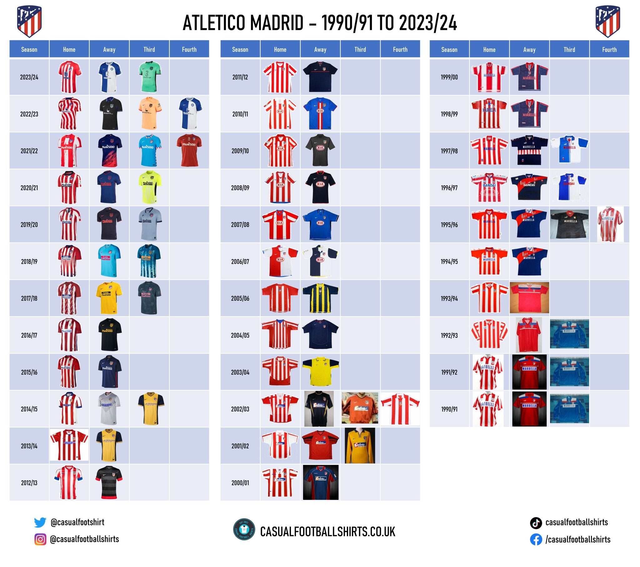
Full Atletico Madrid Shirt History
Atletico Madrid Kit Manufacturer history
2001 – present – Nike
Nike has been the principal partner of Atletico for 22 years and with the deal set to last until 2026, it could reach 25. To put into context how long the pair have been partners for, when the deal was originally struck, Atletico Madrid played in the Spanish Second Division.

Coincidentally, the eleven-time La Liga champions returned to the top flight in their first season donning Nike strips. Atletico won the Segunda Division in 2001/02 with a V-neck polo home shirt which was striped red and white on its base, which also had small blue touches. The arms were predominately white but it did have a red patch running down it, as well as red sleeve cuffs. On their travels for that campaign, the Spanish club would either wear a V-neck red strip with tonal horizontal stripes and black touches or a simple yellow V-neck polo with a blue collar.

In their top division return season (2002/03), the aforementioned red shirt was kept on as their third kit, but the home and away strips were new designs. The home was striped red and white on its base, but its sides was three quarters white and a quarter red. The arms were mostly red and there was also a red patch running across the shoulders to separate the back from the front. The away shirt was a dark blue crewneck with gold side panels, sleeve cuffs and neckline.

As the club was founded in 1903, Atletico celebrated in the 2002/03 campaign with a beautiful centenary shirt. It was centre badge designed V-neck polo in the club’s traditional colours. The crest had a golden scroll underneath it with 1903 – 2003 written within it. The Nike tick was also gold and placed directly underneath the club’s emblem.
2003 until 2005 saw some of the strangest Atletico shirts come to life given the club’s sponsorship deal with movie company Columbia Pictures. The agreement meant that their kits were used to advertise new films whenever they were brought out. The oddest feature that springs to mind was the webbed Spider-Man away kit, which they wore in 2004/05.

However, in the midst of all the drama (no pun intended), the Spanish club was also part of Nike’s anti-racism initiative which saw a half black and half white strip brought together in that same season.
The 2013/14 collection has gone down in the club’s history books, given it was the year that Diego Simeone lead the Spanish giants to their first La Liga title since 1995/96 – breaking the Barcelona and Real Madrid dominance. Atletico came from behind to clinch a 1-1 draw at the Camp Nou wearing their yellow and blue block design away strip in a historic final day.
The season prior to this was equally as significant, as the club won the Copa Del Rey for the first time since the 1995/96 double year. In 2012/13, Atletico wore a black and grey horizontally striped kit with red patches around its sleeves and shirt outline. ‘A Feeling, A Passion, A Pride’ was printed inside the shirt.

The next La Liga title came in an equally dramatic fashion in 2020/21, as Luis Suárez scored the winner in a 2-1 victory over Real Valladolid on the last day of the campaign to pip Real Madrid to the trophy by two points. With a classic dark blue polo collar, Nike incorporated red and white brushstrokes stripes for the home shirt that season. The away jersey was a plain dark blue with red details, including hoops around the collar. Quite fittingly, to pay homage to the Fountain of Neptune where Atletico traditionally celebrate their title wins, a trident graphic was printed on to the inner neck. The third shirt was the most eye-catching of the lot, as it was a light lemon colour with a white pattern marked across the base. It also had black side panels.
Atletico moved to their new stadium, the Civitas Metropolitan Stadium, in 2017, so the 2020/21 title win was, of course, their first one in their new surroundings. To mark their move to a new home, Nike added diagonal sash cut-outs across the classic red and white vertically striped home strip - something we haven’t seen before in the club’s history. Making the strip even more iconic, the club lifted the UEFA Europa League trophy after defeating Marseille 3-0 at Parc Olympique Lyonnais while wearing it.
All three of the regular strips for the 2021/22 campaign paid tribute to the 75th anniversary of the club’s name change to Club Atlético de Madrid, but to further honour it, a commemorative fourth kit was released which purchasing supporters would receive in a special box that includes a copy of the original documentation officially communicating the change of name as of 1st January 1947. The kit was simply red, but '75 años honrando tu nombre' ('75 years honoring your name') was printed in the middle of its chest. The players first wore the strip against Real Sociedad in the Copa Del Rey Round of 16.
To celebrate reaching the milestone of 120 years since their birth, Atletico wore a modern version of the clubs first ever shirt against RCD Mallorca in April 2023. It’s a half blue and half white crewneck with a white neckline and sleeve cuffs. It also features their first ever emblem which was proudly worn from 1903 – 1911. Recognition is also paid on the inside back neckline with 120 printed in red. Originally, members could buy it for 24 hours exclusively at the club’s private shop. However, much to many of the fans’ delight, it has now been brought back to act as the club's 2023/24 away jersey.
1998 – 2001 – Reebok
American brand, Reebok, had a three-season stint with Atletico Madrid and it unfortunately ended on a sour note given the clubs relegation to the second division, despite reaching the Copa Del Rey final in the same campaign. Within the relegation year, the ten-time Copa Del Rey winners had two lovely polo necked kits with Reebok opting to brand the strips with the word Reebok as opposed to their logo. The home top was traditional, while the away was navy blue with red side panels and a red collar. White details also featured here and there.

Reebok gifted the club a really smart centre badge away strip which was worn in both 1998/99 and 1999/00. It was navy with a white and red detailed polo collar and sleeve cuffs. Red also ran on its shoulders. Its main feature was the conjoined red and white stripe running vertically to the right side of the shirt. The white section was slightly bigger than the red part. To add to it, a vertical row of embossed Reebok and Atletico Madrid logos ran concurrently in the background throughout the strip.

One of our all-time favourite Atletico home strips came in 1998/99. Reebok delivered an absolute classic jersey which you should definitely consider when scouring the market for a Spanish club retro shirt. It was striped in the club’s traditional colours with imprinted Reebok logos within its red stripes and throughout its red arms. Furthermore, one large blue Reebok logo was also placed on its right arm, but it didn’t look random as the shirts neckline also incorporated blue, as did the sponsorship features on its base.
1983 – 1998 – Puma
Puma, headquartered in Germany, had a 15-year spell as the kit suppliers for Atletico and reports suggest a reunion was almost agreed in 2019. Some classic shirts were produced within this period, but there is only one place to start – 1995/96. This particular campaign goes down as one of the greatest in Atletico Madrid history given, as aforementioned earlier in the article, it is the season which they won the league and cup double.

Their home kit for the above-mentioned campaign just drips prestige. It had a red polo collar with blue elements incorporated and vertical red and white stripes on its base. The sleeves were red with a white patch running down them which had blue and red features. Embossed into the shirt was the Atletico Madrid crest and the years of all of their honours to that date. Classic.
The Vicente Calderón Stadium, Atletico’s former home, opened in 1966, so to celebrate its 30th birthday in both 1995/96 and 1996/97, the club had a blue away strip with their stadium imprinted into the background. The shirt had a red sash running from its left side to the right sleeve cuff and within the red sash was eight white brushstroke lines.
To pay further recognition to the milestone, in 1996/97 the home top also had the stadium within its background, as well as ‘Club Atletico de Madrid’ within the red stripes. Thin blue vertical stripes were also added between the red and white ones. Interestingly, they removed the embossed stadium from both the home and away shirts for Champions League nights.
Moving back to the fondly remembered 1995/96 season, Atletico beat Barcelona 1-0 in Zaragoza thanks to a Milinko Pantić goal wearing a specially designed final strip. Making it different to the usual Atletico home jerseys was the thin white stripes within the usually predominant red ones. A large club emblem was also imprinted into the background and, like within the 1996/97 home top, thin blue stripes also featured.
From 1996 until 1998, Atletico paid tribute to their first ever blue and white home shirt with a similar half and half strip. However, instead of buttons, the polo collar was brought together with a red lace – how vintage is that?
These articles don’t usually focus on goalkeeper jerseys, but you have to take a look at the 1997/98 edition. It was strikingly blue and yellow with semicircles, stars and the players name and number plastered on the front. Yes, it looks as random as it sounds.
1980 – 1983 – Meyba
Meyba is a Spanish brand which was founded in Barcelona. The manufacturers mainly focussed on Spanish clubs, but they did venture outside of the country on five occasions.
The most interesting shirt which they produced was the 1982/83 home top which had red dashes running down its sleeves. The V-neck polo collar was also eye catching with it being half red and half white.
1950 – 1980 – Deportes Cóndor
Deportes Cóndor still have a store based in Madrid and they spent three decades manufacturing for Atletico. There were no mad designs and the strips were typical for their era, but the pair won five La Liga titles together, as well as five Copa Del Rey’s, a Copa Eva Duarte and an Intercontinental Cup.
Atletico Madrid Shirt Sponsor History
There are a couple of interesting talking points to go through with Atletico’s shirt sponsor history, so let’s get stuck in…
2023 – present – Riyadh Air
Riyadh Air is going to be a Saudi Arabian airline and I use the phrase ‘going to be’ intentionally, as it isn’t actually planned to start operating until 2025. It is controversially owned by Saudi Arabia’s Public Investment Fund and this is the airlines first ever sponsorship deal as it was only founded in March 2023.
Their feature on the strip thankfully isn’t an eye sore and it involves Riyadh Air in white text on a curved blue background. It also has the airlines logo, which is a fancy R, above it.
2022 – 2023 – WhaleFin
Prior to Riyadh Air, Atletico had a deal with WhaleFin and it is another controversial one. When the deal was originally penned, it was supposed to last until 2027, however the cryptocurrency company ended the contract early due to the crash in the crypto market.
Yes, their sponsor slot did include a whale, but it also had their website URL below it. Looking at it through the eyes of design only, it didn’t look too bad, but there is an argument that it isn’t a good move for the club to delve into that particular industry.
2015 – 2022 – Plus 500
Despite the suggestions that delving into the online trading market is a controversial move for football clubs, Atletico are no strangers to it, given that they had a long-standing partnership with Plus 500.

Rosolino Amenta, the Global Head of Partnerships at Atletico Madrid, labelled the deal “one of the most successful football sponsorships in Europe” during the announcement that the agreement had ran its course.
Plus500 had various versions of their branding on the Atletico strips. From 2015 until 2017, Plus 500 was printed with ‘+ trade online’ in a small font above it. Unfortunately, on the home strip it was stuck on with a white background, but on the away and third kit it wasn’t – it looked much better without.
In 2017, it changed to ‘trade’ printed largely above the Plus 500 and it did become a little bit of an eye sore. Thankfully this only lasted until 2019.

‘Trade online’ was placed in a smaller text again from 2019 until 2021, but this time it was below the Plus 500. Sadly, on the home kits it still had that white background.
For their final year together, 2021/22, the branding was absolutely smashed. There was no white background and it was simply ‘Plus 500’ with a ‘+’ above it.
2013 – 2015 – Azerbaijan
Azerbaijan took to sport in attempt to raise their profile and struck a deal with Atletico which initially cost them just €12m, ending the football clubs two-year sponsor-less spell. According to the Guardian, this included a feature in the shirt sponsorship slot and for Atletico players and coaching staff to train young Azerbaijani footballers in Madrid and Baku.
This was part of a wider plan from the nation, as they also hosted Eurovision in 2012 and an inaugural European Games in 2015. They also launched a bid for the Olympic Games, but they haven’t yet been successful.
Speaking of Baku 2015, its logo also replaced Azerbaijan’s usual sponsorship feature for several La Liga fixtures, including the Madrid Derby, and for Champions League games in 2014/15. This was an attempt to gain maximum exposure for the event.
Their regular sponsor was ‘Azerbaijan’ with the country’s slogan ‘the land of fire’ underneath it. The nations colours were also included in a small feature alongside it. I think it looked good, despite the blue background, as it was tidy and made to look part of the design.
2006 – 2011 – KIA
Kia has a history stretching back until 1944 and it is Korea's oldest manufacturer of motor vehicles. The company has sponsored a fair few football clubs, but I think it is fair to say that Atletico Madrid is the most high profile.

Their feature was simply ‘KIA’ in red text, placed in a red and white oval. Taking into account the club’s colours, it suited them to a tee.
2003 – 2005 – Columbia Pictures
This deal has to go down as one of the craziest partnerships within the world of football. Maybe even within the world of sport.
As alluded to earlier the article, Columbia Pictures used this deal to promote movies on the Atletico shirts whenever they were released or premiered. In 2003/04, the club had SIXTEEN different logos taking that centre spot.

However, the agreement wasn’t lob sided, as in return several famous actors including Will Smith, Harrison Ford, Halle Berry, Tobey Maguire and Kirsten Dunst posed holding up Atletico Madrid jerseys. You can see all the shirts here.
Would you like to see something like this happen again?
2000 – 2003 – Idea Electrodoméstico
Idea Electrodoméstico is a Spanish brand that sells household appliances. Their feature included their logo which is simply ‘idea’ with the I on a red background and the remainder of the word on a blue one. It wasn’t a complete eyesore but, design-wise, there has been better sponsors.

1997 – 2000 – Marbella
The city of Marbella has featured on the shirts of a couple of other Spanish clubs alongside Atletico Madrid, including Real Valladolid, Sevilla and Real Betis. However, due to their inside links, Atletico were actually the first club to have an involvement. Jesus Gill, president of the club from 1987 until 2001, also served as the Mayor of Marbella from 1991 until 2002. Gill wasn’t particularly a popular figure at the football club, as he shut down the academy in 1992 and had a volatile relationship with fans, reporters, players and head coaches. His decision to discontinue the academy saw Raul join Real Madrid and like the old saying goes, the rest is history!

Marbella’s sponsorship feature was simply ‘Marbella’ in a solid, readable, outlined text. You just can’t go wrong with that.
1996 – 1997 – Bandai
Bandai is a Japanese toy manufacturer headquartered in Tokyo. Their feature on the shirt was simply ‘Bandai’ with unusual A’s. I think it suited all of the shirts fairly nicely.

There is evidence to suggest that the brand used the Atletico shirts to promote one of their products – the Tamagotchi. The text font they used for this was really cool.
1990 – 1993 and 1994 – 1996 – Marbella
Further to their spell with Marbella in 1997 until 2000, Atletico also wore the City on their shirts in two other periods of their history. Unfortunately, though, I am not sure the branding looked as good in some of these years as it was plastered on a white ‘stick on’ background.
1993 – 1994 – Antena 3 Television
Prior to their second spell with Marbella, Atletico had a partnership with a Spanish terrestrial television channel, Antena 3. Sadly, their feature had a huge background which just didn’t look that good. However, their logo was by no means the ugliest one that I have seen.
1987 – 1990 – Mita
The clubs first ever shirt sponsorship partner, Mita, is a photocopier manufacturer which has since been acquired by Kyocera. The latter is a multinational ceramics and electronics manufacturer headquartered in Kyoto, Japan.
The formers feature on the Atletico collections from 1987 until 1990 included the word ‘Mita’ in lowercase and in blue text on a white background. The text font has earned this one a few extra points – it wasn’t too bad.
Atletico Madrid have been really lucky in finding long-term shirt manufacturers that just keep reaching their demands. They have had a 30-year partnership with Deportes Cóndor, a 15-year deal with Puma and are currently serving an agreement with Nike which could reach 25-years. They have also been extremely fortunate to not have had many really poor shirt designs within these time frames, too.
Their choice of shirt sponsorship deals could perhaps be questioned, though. There are a couple of controversial industries and agreements which they have delved into. Although, if we talk purely from a design perspective, they have been fairly lucky in that sense too.
Vintage Shirts By Decade
-

1980s Football Shirts
Step back into one of football’s most iconic eras with our collection...
-

1990s Football Shirts & Iconic 90s Kits
Relive the era of bold designs, baggy fits and unforgettable sponsors with...
Popular Teams
-

Vintage Manchester United Shirts
Here's my current stock of Manchester United shirts that are for sale....
-

Vintage Arsenal Shirts
Step into true North London nostalgia with our collection of vintage Arsenal...
-

Vintage Chelsea Shirts
Celebrate the iconic eras of Stamford Bridge with our collection of vintage...
-

Vintage Barcelona Shirts
Immerse yourself in the rich tapestry of FC Barcelona with our stunning...
-

Lionel Messi Shirts
Shop authentic Messi shirts from his time at Barcelona, PSG, Argentina and...
-

Real Madrid Shirts
Step into a realm of royal elegance with our Real Madrid shirt...
Latest Stock
-
2007/09 England Home Football Shirt (2XL) Umbro #8 Lampard
Size: 2XL
Regular price £60.00 GBPRegular priceUnit price per -
2016/17 Wales Away Football Shirt (L) Adidas #11 Bale
Size: Large
Regular price £75.00 GBPRegular priceUnit price per -
1998/00 Brazil Home Football Shirt (2XL) Nike #9 Ronaldo
Size: 2XL
Regular price £140.00 GBPRegular priceUnit price per -
2006/07 Holland Away Football Shirt (L) Nike #10 Van Der Vaart
Size: Large
Regular price £80.00 GBPRegular priceUnit price per -
2018/19 Wales Away Football Shirt (XL) Adidas #11 Bale
Size: X-Large
Regular price £60.00 GBPRegular priceUnit price per -
2024/25 France Home Football Shirt (XL) Nike #10 Mbappe (BNWTs)
Size: X-Large
Regular price £80.00 GBPRegular priceUnit price per -
2002/04 Japan Home Football Shirt (L) Adidas #9 Nishizawa
Size: Large
Regular price £90.00 GBPRegular priceUnit price per -
2018/19 Portugal Away Football Shirt (L) Nike #7 Ronaldo
Size: Large
Regular price £75.00 GBPRegular priceUnit price per
Match Worn Shirts
-
Preston North End 2022/2023 Match Worn Shirt - A Fernandez
Size: 2
Regular price £299.99 GBPRegular priceUnit price per -
Manchester City 2025-2026 Match Worn Home Shirt
Size: M
Regular price £299.99 GBPRegular priceUnit price per -
1986/87 Denmark Home Football Shirt (XL) Hummel #10 (Elkjaer) Re-Issue
Size: X-Large
Regular price £55.00 GBPRegular priceUnit price per -
2020/21 Cambridge United Home Football Shirt (M) Hummel #23 Knowles (Matchworn / Signed)
Size: 1
Regular price £70.00 GBPRegular priceUnit price per
