Chelsea Football Shirt History
Chelseas kit manufacturing and sponsorship history is relatively small compared to other clubs, but let’s check them all out.
Like Chelsea? Shop vintage Chelsea shirts
Quick links
Shirt history download | Goalkeeper shirts | Kit manufacturers | Shirt sponsors
Chelsea Shirt History - Download

Chelsea Goalkeeper Shirt History Checklist

Chelsea Kit Manufacturer History
2017 – present – Nike
The Blues ended their deal with Adidas six years early to pen a whopping fifteen-year contract with US sports giants, Nike. Looking at the figures reported it easy to see why that decision was made, with Nike appearing to have doubled Adidas’ agreement.
Their relationship got off to a fairly positive start, with the West London club achieving FA Cup success in their first season together (2017/18). For this campaign, Nike opted for a darker shade of blue to what Adidas had used in recent years on what was a simple, clean home strip. The away shirt was similarly minimalistic in white, while the third top had black camouflaged patterning.
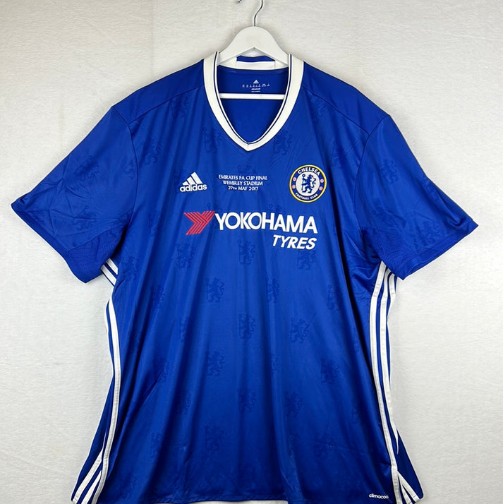
Chelsea 2016/2017 FA Cup Final shirt.
Perhaps Nike played it safe in 2017/18, but the home jersey which followed in 2018/19 was definitely unique. It had spaced out tapered red and white stripes on its front and back which ran from its edges but stopped in its centre. The third strip donned in this season was also distinctive, with its patterning representing a map of the city of West London and the Chelsea city district.
Chelsea wore a classy anniversary shirt in their third round FA Cup home tie against Nottingham Forest in 2019/20 to celebrate 50 years since their first taste of success in the competition. Their actual home jersey for this campaign was equally as interesting with its graphic merging all of the Stamford Bridge stands.
Despite a metallic gold crest in 2023/24, a neckline inspired by the Blues’ infamous Chelsea Lion in 2022/23 and an interesting ‘out there’ zig-zagged chequered hybrid print in 2021/22, it is 2020/21 Chelsea home strip which is probably most famous Nike version. This is due to that famous night in Porto where the Blues were crowned Champions of Europe after defeating Manchester City 1-0 in the Champions League final courtesy of a Kai Havertz winner. The shirts smart, small zigzagged patterning was inspired by London as a men’s fashion hub. Its darker blue side panels had ‘The Pride of London’ subtly printed on in white.
2006 – 2017 – Adidas
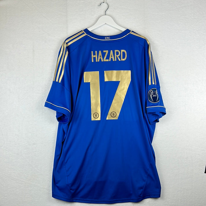
Chelsea’s deal with Adidas lasted for just over a decade and throughout this period the clubs on the pitch success was rife. Proof of this comes in 2011/12, when the Blues picked up their first ever Champions League trophy while wearing that campaigns tonally hooped home jersey, which now has its place in the Chelsea history books forever.
In the following season, Adidas gave the London club golden sponsorship features on the home top giving it a classy, true look of champions.
Chelsea 2012/2013 home shirt with gold trim
Speaking of classy, it is their last attempt of a Chelsea home strip which probably takes the crown for the most sophisticated look. The silky 2016/17 edition had a number of Chelsea lions embossed throughout. A close second is the 2015/16 ‘grandad collar’ top which had tonal pinstripes and small white and red hoops on its sleeve cuffs.
While both the 2015/16 third and away jerseys are also universally popular across the Chelsea fanbase, it is the eccentric design of the third strip worn in the season prior to this that is the most eye catching (2014/15). Its black base had a sound wave graphic imprinted on its front in a turquoise shade.
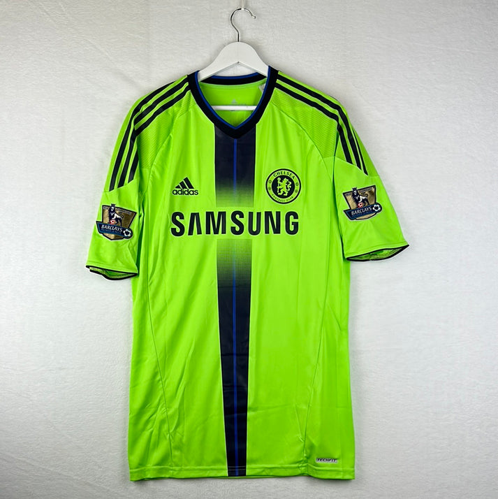
The 2010/11 Chelsea third shirt isn’t so much of a success story. It was green with one blue stripe running down its centre that was sandwiched between two thick navy stripes.
Here is an example of the 10/11 player issue third shirt.
Another disappointing effort was donned in 2007/08. Their illuminous yellow away top released for that season was a little too bold.
1987 – 2006 – Umbro
The Blues won their first Premier League title in 2004/05 and impressively retained it the following year, but the shirts worn in those two seasons are much more diluted compared to what we seen previously during this remarkable nineteen-year partnership.
Umbro put together several unconventional designs throughout this period and unsurprisingly this meant that some fantastic football shirts were created, although, it also resulted in the London club wearing some bad ones too.
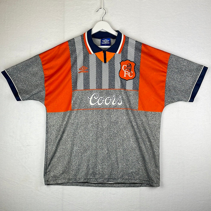
Before we get into the good, we’ll start with the less appealing ones that the double diamond brand pieced together and the away shirt worn from 1994 until 1996 is the perfect example of that. The polo design was a grainy grey with orange features and it also had patterned horizontal tonal stripes running across the chest area. (This is the writers opinion and we know this has become a popular retro Chelsea shirt recently - mainly because of how memorable it is!)
It’s replacement in 1996 that was donned until 1998 wasn’t much better – the central crest jersey had tonal yellow stripes that were broken up on its chest by blue applications. Dark and baby blue stripes also ran down its arms and shoulders.
Moving on to the good, prior to the two aforementioned strips, from 1992 until 1994, Chelsea wore a sublime, classical away shirt. It was white with red pinstripes and its blue collar was pulled together with red lace.
For the 1993/94 season, this kit was partnered by an interesting third shirt that was striped yellow and black, however the black stripes also incorporated white pinstripes.
While on the subject of alternate jerseys, it is interesting to mention that the early years of this deal, Umbro provided the Blues with a couple that accommodated more red than we are used to seeing today. One honourable mention of this is the red, blue and white hooped shirt worn from 1988 until 1990 and another is the diamond chequered red and white strip that was played in for two seasons from 1990/91.
Though it wasn’t all about alternate kits throughout this period, with several top-class home tops designed too. The first of which that deserves a mention is actually the first ever Chelsea Umbro shirt of this tenure that was worn from the beginning of the partnership until 1988 – it was blue with white pinstripe lines passing over each, almost chequered like.
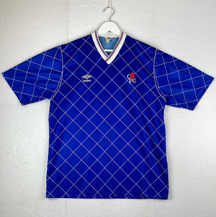
It’s successor in 1990 was arguably just as, if not more, impressive – this one had a polo collar with an intriguing pattern which included tonal differences and diamond shapes. Another home kit with a funky background design was released in 1991, while the 1996 – 1998 version coolly had a Chelsea lion and ‘CFC’ embossed into it.
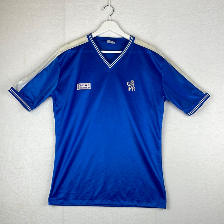
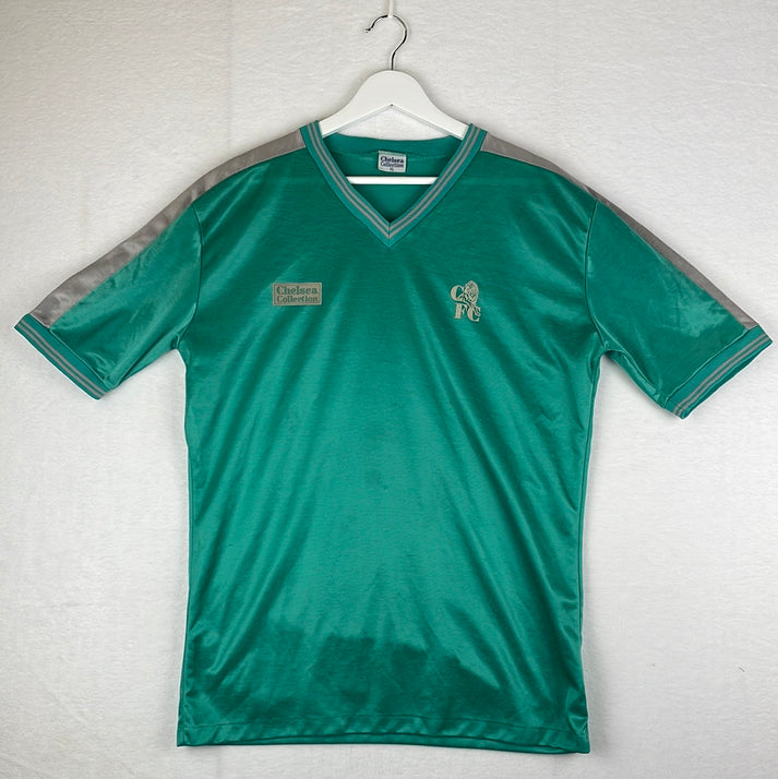
1986 – 1987 – In House
Chelsea spent the 1986/87 campaign wearing a minimal range designed in house. It was labelled the ‘Chelsea Collection’.
I was fortunate enough to get both the home and away shirt in stock when I bough a large collection of Chelsea shirts from a collector. These are the only ones I've seen for sale in a long time. The quality of the shirts was questionable meaning there's not many of them left now.
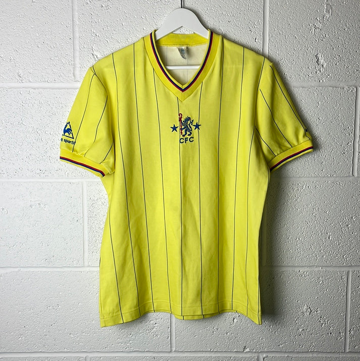
1981 – 1986 – Le Coq Sportif
The home shirts were the most eye-catching element of Le Coq Sportif’s era and they got off to a flying start in 1981. Their first design for the Blues had a V-neck and a central crest that was filled with spaced out white pinstripes and the French manufacturers logos were placed on its arms. A yellow and black version of this was worn away.
Le Coq Sportif backed their sound start up with a classy hooped home jersey in 1983.
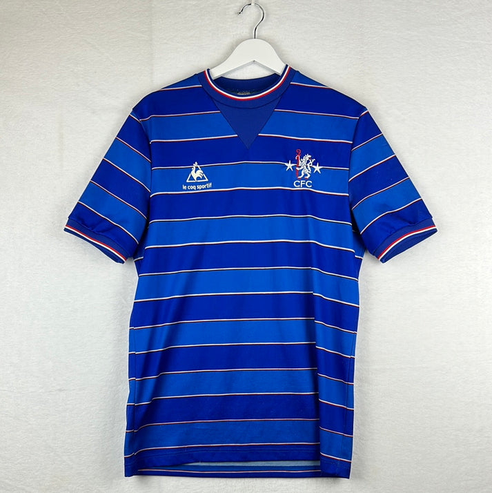
The colour of the blue hoops tonally alternated and they were broken up each time with thin, narrow red and white rings. This period was then signed off with an elegant home top that featured stripes in different shades of blue. The lighter shaded stripe had Le Coq Sportif logos imprinted throughout it.
1970 – 1981 – Umbro
Chelsea’s first ever supplier was Umbro and it remained the case for eleven years, taking the total time that the pair have spent in partnership together to thirty years. The designs throughout this period were fairly simplistic and the double diamond logo didn’t actually appear on a strip until 1975.
However, you could argue that Umbro made up for lost time by having conjoined Umbro badges running down the arms of the shirts, as well as in the typical manufacturer sponsor slot, from 1977.
Chelsea Shirt Sponsor History
In comparison to some other clubs, Chelsea have a relatively small list of shirt sponsorship deals, but let’s find out more about them…
2023 – present – Infinite Athlete
Sports Technology company Infinite Athlete agreed a one-year deal with the Blues after Chelsea were left stuck by the Premier League when they blocked a potential deal that the club had in place with Paramount+ due to the risk of upsetting Premier League rights holders.
Coincidentally, Infinite Athlete is the global parent company of Tempus Ex Machina™, which entered into a seven-year partnership with the club earlier in 2023.
Their branding on the shirt includes their logo with ‘Infinite Athlete’ beside it. The font used has a slick effect in block capitals – it looks good.
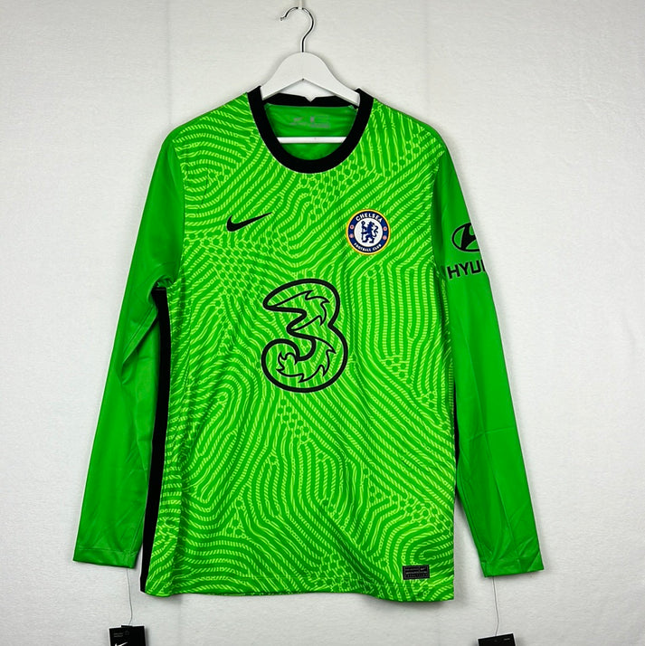
2020 – 2022 – Three
Telecommunications brand Three appeared on the shirts for two seasons, but they still remain the club’s ‘telecommunications partner’ to this day. Three’s huge ‘3’ logo isn’t the most ideal choice for a football shirt.
Chelsea 2019/2020 goalkeeper shirt
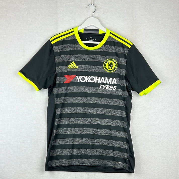
2015 – 2020 – Yokohoma Tyres
Japanese Tyre company Yokohoma paired with Chelsea for five years, however, like Three, they continued their relationship with the club by remaining their official ‘Global Tyres Partner’ once the shirt sponsor deal had ended.
Yokohoma’s branding was ideal for a football shirt as it was easy to read, easy to understand and it wasn’t overpowering in the slightest.
Example: Chelsea 2016/2017 away shirt
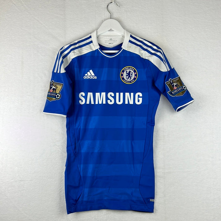
2005 – 2015 – Samsung
Samsung had a long-standing partnership with the Blues and their area of expertise is electronic technology.
Example: Chelsea 2009 FA Cup final shirt
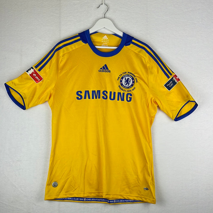
In fact, they used the shirt to promote their mobile phone products in the first three seasons of the deal by adding the word ‘mobile’ under the famous Samsung text. Nothing replaced the word mobile for the remainder of the deal once it was removed, although the brand did allow The Chelsea FC Foundation to take the whole slot for a game in 2014/15.
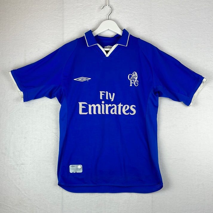
2001 – 2005 – Fly Emirates
Now sponsoring the likes of Arsenal, AC Milan and Real Madrid, Fly Emirates’ branding is one of the most recognisable across the footballing industry. The airline uses a text-based feature for their sponsorship slot and in Chelsea’s case they simply stuck to ‘Fly Emirates’ with no added promotion.
Example: Chelsea 2001/2002 home shirt
1997 – 2001 – Autoglass
Autoglass specialises in car windscreen replacements and you’re now probably thinking of their famous advert theme tune in your head. It's a shame they never made a shirt with "Autoglass repair, Autoglass replace" on the front!
Example: Chelsea 1998/1999 third shirt
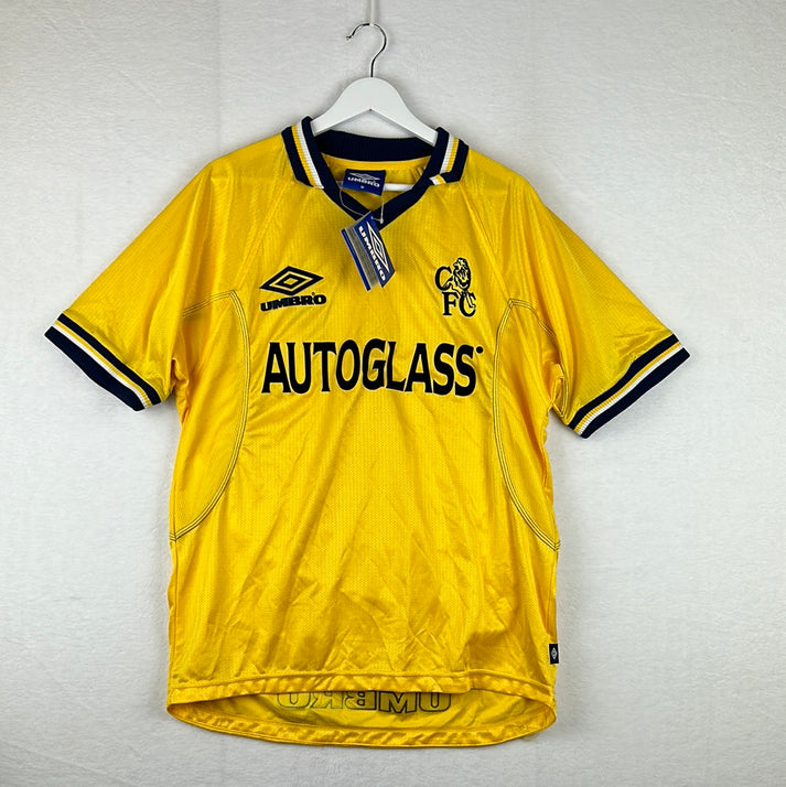
Jokes aside, there wasn’t a scratch (sorry!) wrong with their branding on the Chelsea shirts. They used their feature to simply print ‘Autoglass’ in a thin font.
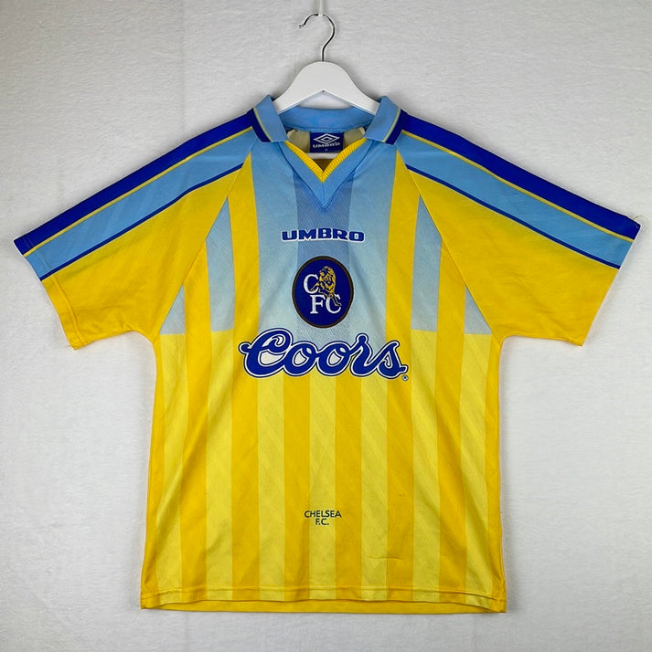
1994 – 1997 – Coors
Coors is an American Brewing Company that was founded in 1873. The joined-up font which Coors use throughout their branding has become recognisable and this is all that appeared on the Blues’ shirts.
Example: Chelsea 1996/1997 away shirt
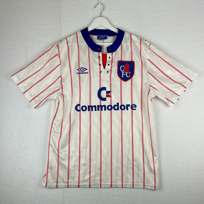
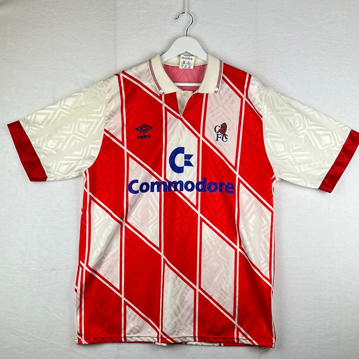
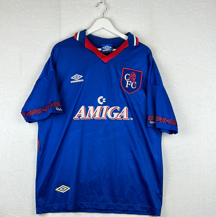
1987 – 1994 – Commodore / Amiga
Canadian company Commodore was once one of the world's largest personal computer manufacturers. Their sophisticated branding included their ‘C’ like logo printed above their name. As shown in the 1991/1992 third shirt.
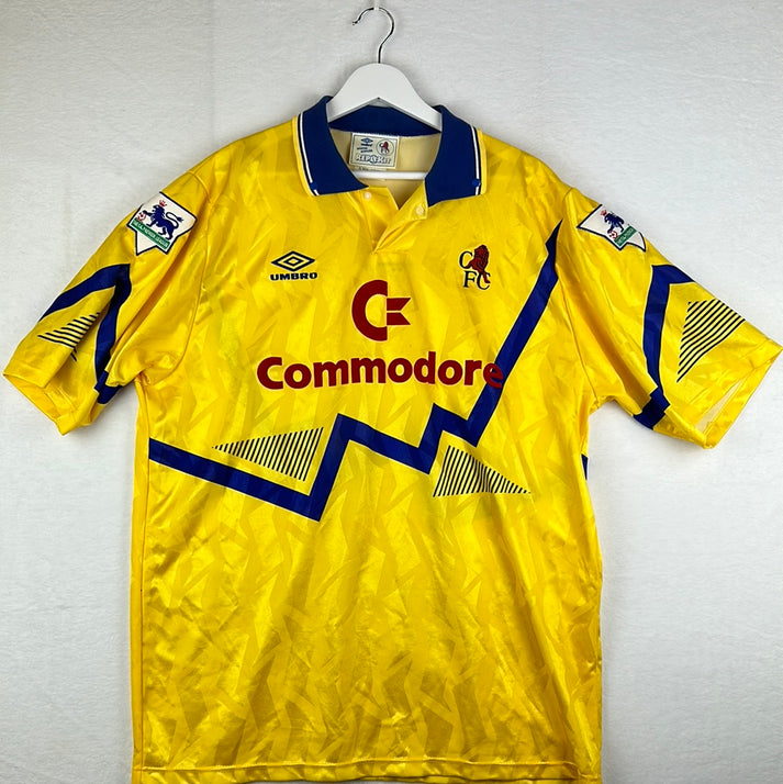
For the final campaign honouring the shirt, they kept their ‘C’ like logo but replaced the word Commodore for ‘Amiga’ – which is one of their personal computer ranges. As shown in the 1993/1994 home shirt -
1986 – 1987 – Simod
Simod had a text-based feature and they are an Italian sportswear manufacturer.
1983 – 1984 – Gulf Air
Gulf Air is an airline and their main hub is Bahrain International Airport. They were the clubs first ever front of shirt sponsor.
Conclusion
Given the previous between the pair, it would be romantic to one day see an Umbro and Chelsea reunion, however on the face of it, it appears Nike have been solid suppliers so far, both design wise and financially. The Blues have escaped catastrophic designs on their home strips over the years but have fell casualty to a few questionable alternate jerseys.
Vintage Shirts By Decade
-

1980s Football Shirts
Step back into one of football’s most iconic eras with our collection...
-

1990s Football Shirts & Iconic 90s Kits
Relive the era of bold designs, baggy fits and unforgettable sponsors with...


Popular Teams
-

Vintage Manchester United Shirts
Here's my current stock of Manchester United shirts that are for sale....
-

Vintage Arsenal Shirts
Step into true North London nostalgia with our collection of vintage Arsenal...
-

Vintage Chelsea Shirts
Celebrate the iconic eras of Stamford Bridge with our collection of vintage...
-

Vintage Barcelona Shirts
Immerse yourself in the rich tapestry of FC Barcelona with our stunning...
-

Lionel Messi Shirts
Shop authentic Messi shirts from his time at Barcelona, PSG, Argentina and...
-

Real Madrid Shirts
Step into a realm of royal elegance with our Real Madrid shirt...


Latest Stock
-
Arsenal 1993/1994 Away Shirt - Large - Excellent
Size: 3
Regular price £169.99 GBPRegular priceUnit price per -
England Player Issue 2024 Home Shirt - v Denmark - Bellingham 10
Size: L
Regular price £349.99 GBPRegular priceUnit price per£99.99 GBPSale price £349.99 GBP -
Sheffield Wednesday 1990/91 Away Shirt
Size: L
Regular price £159.99 GBPRegular priceUnit price per -
Arsenal 1993/1994 Away Shirt - 44-46 Size - Excellent
Size: 2XL
Regular price £169.99 GBPRegular priceUnit price per -
Barcelona 2007/08 Home Shirt
Size: S
Regular price £59.99 GBPRegular priceUnit price per -
Arsenal 1993/1994 Away Shirt Small
Size: S
Regular price £149.99 GBPRegular priceUnit price per£139.99 GBPSale price £149.99 GBP -
2014/15 Fortuna Dusseldorf Third Football Shirt (L) Puma
Size: Large
Regular price £45.00 GBPRegular priceUnit price per -
2015/16 Cambridge United Home Football Shirt (XL) Puma
Size: X-Large
Regular price £50.00 GBPRegular priceUnit price per


Match Worn Shirts
-
England Player Issue 2024 Home Shirt - v Denmark - Bellingham 10
Size: L
Regular price £349.99 GBPRegular priceUnit price per£99.99 GBPSale price £349.99 GBP -
England 1992 Player Issue Third Shirt
Size: 3
Regular price £399.99 GBPRegular priceUnit price per -
2024/25 Cambridge United Home Football Shirt (M) Umbro #45 Longelo (Signed | Match Issue)
Size: 0
Regular price £75.00 GBPRegular priceUnit price per -
Lisburn Distillery 2022-23 Match Worn Away - Size L (M Fit) - #19
Size: 0
Regular price £34.99 GBPRegular priceUnit price per


